Preview image. Unlock full-res
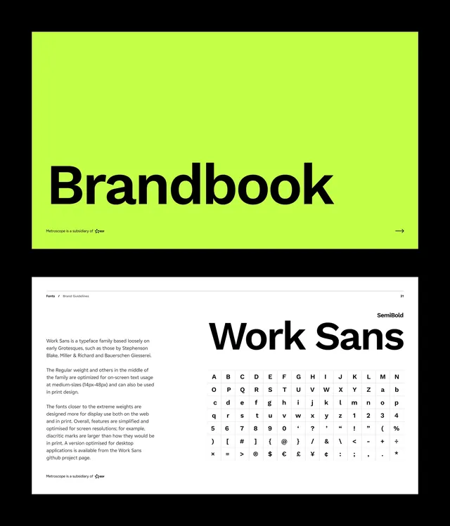
Two-page corporate identity overview with neon lime-green accents and bold sans-serif typography establishing high-contrast professional branding.
Summary
A corporate identity system using neon lime-green backgrounds and bold black typography to create maximum contrast and commanding visual presence across two pages.
Visual description
The top page features a full-bleed lime-green background with oversized black sans-serif heading "Brandbook" anchoring the upper left. A small navigation arrow and subtitle appear lower on the page. The bottom page shows detailed typography guidelines: a centered "Work Sans" heading with a comprehensive character grid displaying the complete font charset in black on white. Descriptive text in smaller type fills the left margin explaining font usage and styling guidelines.
Key takeaway
The strategic use of neon green as the dominant brand color creates immediate visual impact and differentiation. The overwhelming contrast between lime and black ensures legibility from any distance. Using a custom grid to showcase the full typeface character set makes typography guidelines concrete and instantly scannable.
Reuse notes
Strong for tech, startup, or agency brands wanting assertive, contemporary presence. The lime-green reads as young and forward-thinking; pair with neutral grays for softening in applications that need less aggressive energy. Works especially well in digital-first contexts where the neon can render with true saturation.
More like this






Keep what you find
A free account saves references to boards and can send you a weekly email of picks based on what you save.
To see every result, go Pro.