Preview image. Unlock full-res
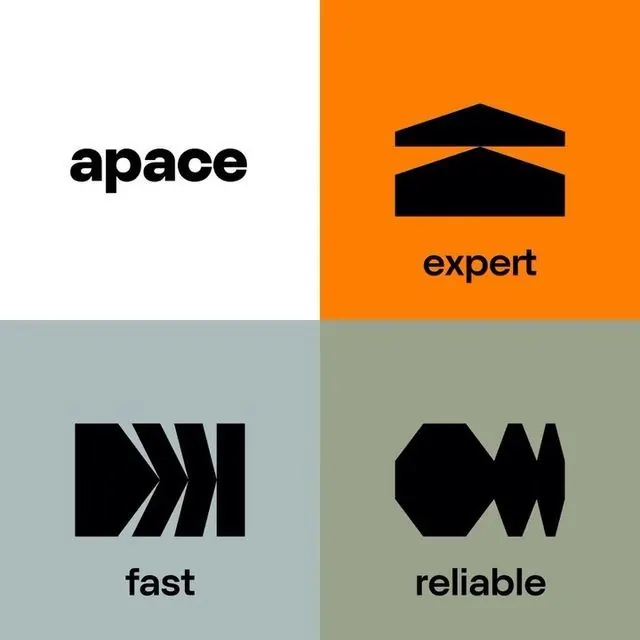
A four-quadrant brand identity pairing bold sans-serif words with abstract geometric marks in a coordinated color palette of orange, sage, dusty blue, and white.
Summary
A four-quadrant brand identity pairing bold sans-serif words with abstract geometric marks in a coordinated color palette of orange, sage, dusty blue, and white.
Visual description
The design divides into a 2x2 grid. Top-left: white background with "apace" in heavy black sans-serif. Top-right: bright orange with a pair of nested black horizontal bars and the word "expert" in black below. Bottom-left: dusty blue-grey with black chevron or arrow marks and "fast". Bottom-right: sage green with stacked black angles forming an abstract wave or infinity symbol, paired with "reliable". Each quadrant uses centered typography and a single geometric icon rendered in solid black, unified by consistent sans-serif weight and scale.
Key takeaway
The discipline of pairing one word with one mark per quadrant, creating a modular system that's both complete and infinitely extensible. The restrained color palette (four colors plus black and white) that still feels dynamic. The geometric marks that suggest meaning (arrows for speed, bars for stability) without being literal.
Reuse notes
Excellent template for professional services, architecture, engineering, or tech companies that need to communicate multiple brand pillars or service areas. The modularity makes it easy to scale to six or nine quadrants. Requires a confident brand position (works for 'we are bold and trustworthy'), less ideal for consumer or lifestyle brands. Light versions (reversed colors) would work on dark backgrounds.
More like this





Keep what you find
A free account saves references to boards and can send you a weekly email of picks based on what you save.
To see every result, go Pro.