Preview image. Unlock full-res
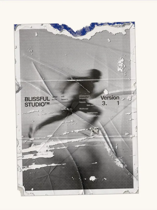
A weathered editorial poster series for Blissful Studio v3.1, combining halftone photography, torn paper textures, and bold typographic identity in a striking monochrome aesthetic.
More like this
See all
Summary
A weathered editorial poster series for Blissful Studio v3.1, combining halftone photography, torn paper textures, and bold typographic identity in a striking monochrome aesthetic.
Visual description
A single portrait poster sits tilted on a warm off-white ground, rendered in a coarse halftone grayscale with a motion-blurred running figure filling the center. The paper looks creased, scuffed and peeled, with white abrasion marks across the surface and a torn top edge that reveals a patch of saturated cobalt blue, the only color on the page. Small bold grotesque type reads BLISSFUL STUDIO with a trademark mark on the left and Version 3.1 on the right, with tiny scattered lines of service text set in light sans between them. The type is small against the large image, so the blurred photograph and the distressed texture carry the hierarchy.
Key takeaway
Pair a fully monochrome halftone image with one torn-edge reveal of a single saturated color, so a worn, physical surface gives a digital studio identity instant character.
Reuse notes
Reach for this as a identity system reference. Pairs with typographic, experimental directions. Original by Steve Lauda.
More like this



Keep what you find
A free account saves references to boards and can send you a weekly email of picks based on what you save.
To see every result, go Pro.