Preview image. Unlock full-res
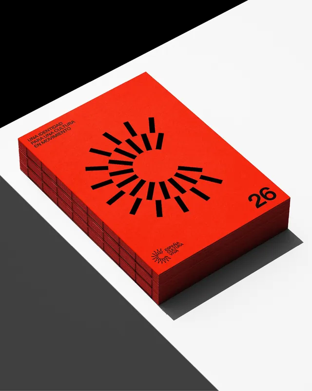
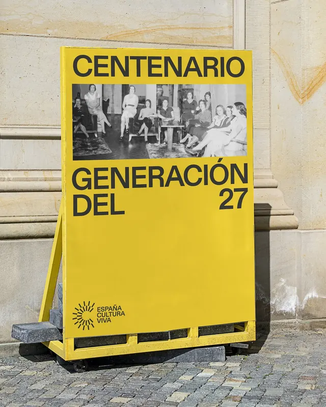
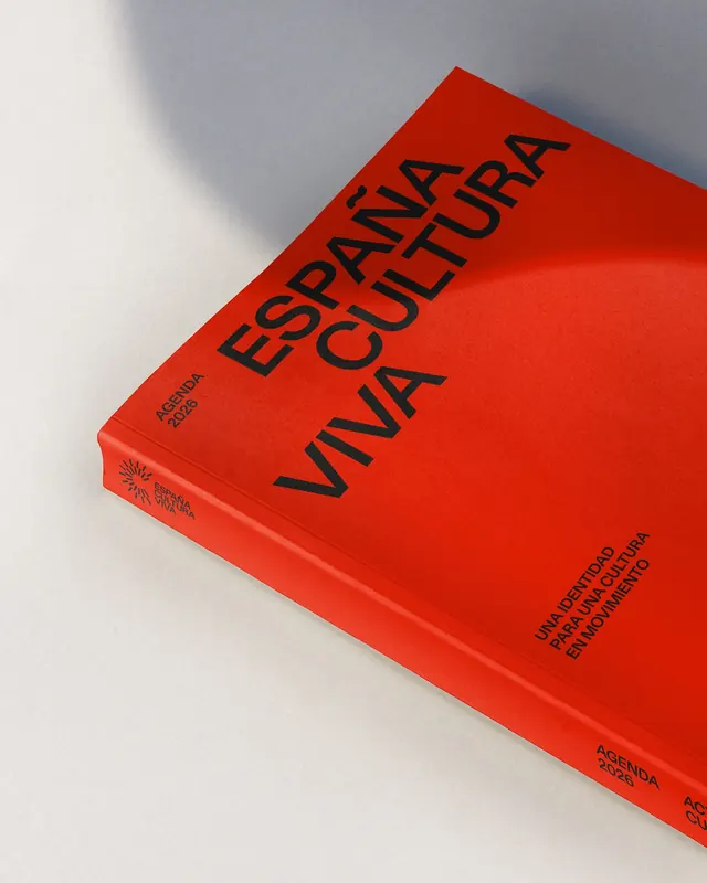
Nine-slide visual identity and collateral system for España Cultura Viva, a Spanish government initiative to strengthen international presence of Spanish culture.

Summary
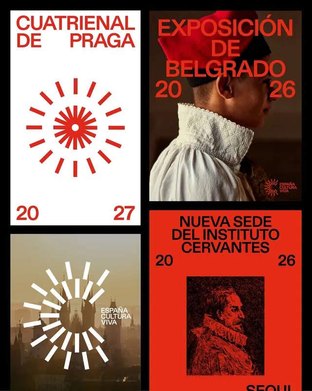
A comprehensive visual identity system for España Cultura Viva, a Spanish government program promoting cultural and creative industries. The nine-slide deck showcases the distinctive red-and-black brand language applied across multiple collateral formats including publications, posters, and environmental graphics.
Visual description
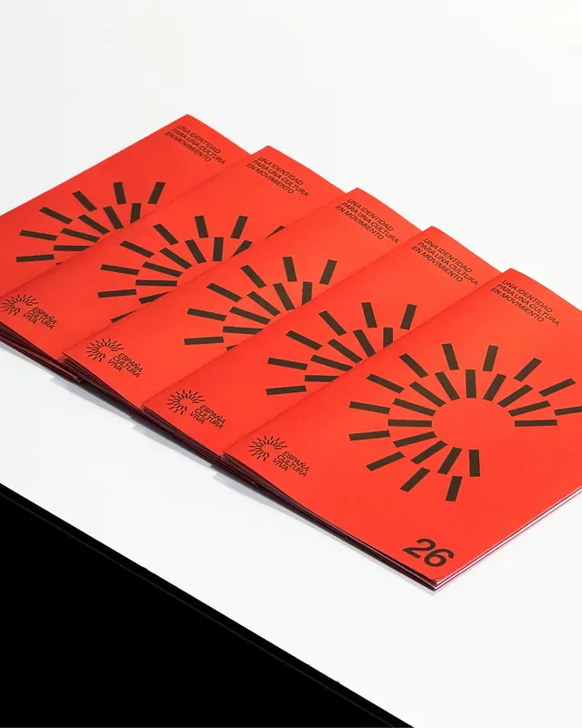
The carousel opens with a bold isometric 3D book cover rendered in bright red with a striking black sunburst icon - the core mark anchoring the system. Slide 2 is largely blank, creating a breathing pause. Slide 3 unveils a collage of textured environmental applications: architectural photographs, material swatches in earth tones and reds, and framed cultural imagery arranged in a dynamic diagonal composition. Slide 4 returns to the book spine, emphasizing the texture and layered printing visible on the edge. Slides 5–9 showcase application variations: different cover angles, poster treatments combining stark geometry with cultural photography, and a final agenda book shown in a three-quarter view against a light background. The palette is disciplined: primary red (#ff0000), solid black text, and white space, with occasional warm neutrals for material texture. The typography is clean sans-serif, letterspacing generous, often set in all-caps for impact. The overall system balances minimalist geometry (the sunburst motif) with rich contextual imagery (cultural and architectural photographs), creating a design language that feels both contemporary and rooted in cultural heritage.
Key takeaway
The sunburst icon is extraordinarily simple but distinctive - a radiating pattern that suggests cultural energy and vitality without being prescriptive about what that culture is. The red-and-black palette is bold but timeless, working equally well in 3D mockups and flat graphic contexts. The textured materiality (visible spine edge, layered printing) signals quality and craftsmanship while staying modern. Generous letterspacing in display type reinforces the confidence and openness of the brand.
Reuse notes
Strong blueprint for government, nonprofit, or cultural institution identity work that needs to feel authoritative without appearing stodgy. The sunburst is a flexible icon that could adapt to many cultural contexts. The red-and-black palette with white space is particularly effective in print but translates well to digital. The material texture exploration is useful reference for brands wanting to communicate "handmade" or "locally rooted" qualities. Caution: the system is deliberately constrained; it works because the red-and-black discipline is absolute - would lose power with palette expansion.
From this post: España Cultura Viva identity system
View post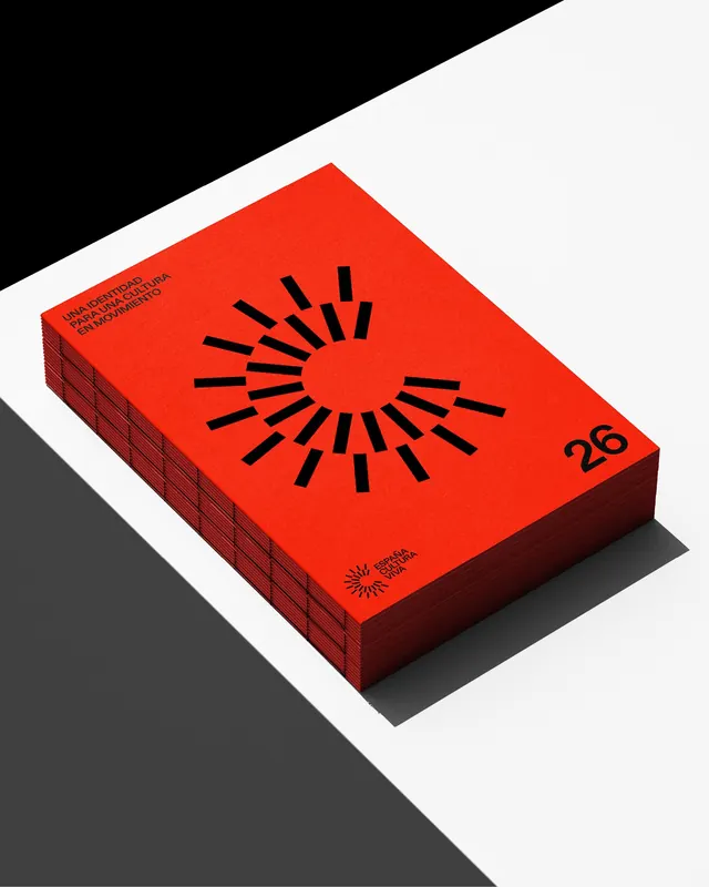
More like this



Keep what you find
A free account saves references to boards and can send you a weekly email of picks based on what you save.
To see every result, go Pro.