Preview image. Unlock full-res
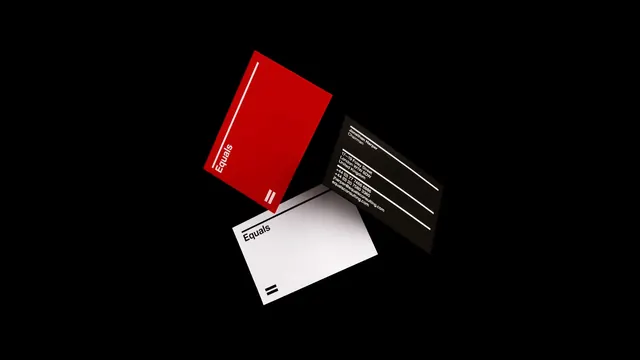
Three-card branding system with minimal typography, red and black color scheme, and Swiss design principles — hierarchy through color blocking.
Summary
A minimalist business card system featuring three cards using stark black, white, and coral red to establish hierarchy and brand identity through color blocking and typography alone.
Visual description
Three business cards displayed at a slight angle on a dark background. The leftmost card is bright coral-red with white typography. The middle card is white with small black typography. The rightmost card is black with red or white typography. Each card carries minimal text aligned to the grid, using a clean sans-serif face. The system demonstrates hierarchy and variety through color alone, with consistent geometry and spacing.
Key takeaway
Color blocking as the primary hierarchy tool in a minimal system. Three simple variations generate a complete brand expression without illustration or decoration — pure geometry and typography.
Reuse notes
A reference for minimal corporate identity systems, B2B branding, or any context where Swiss design discipline and restrained color palettes need to convey professionalism and clarity.
More like this






Keep what you find
A free account saves references to boards and can send you a weekly email of picks based on what you save.
To see every result, go Pro.