Preview image. Unlock full-res
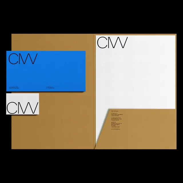
A minimalist architecture studio identity system using cobalt blue, kraft tan, and cream, with a thin-weight sans-serif monogram and carefully balanced stationery layout.
Summary
A corporate identity system for an architecture studio built on primary colors (cobalt blue and kraft tan) with a refined monogram and restrained stationery applications, embodying Swiss minimalism and austere modernism.
Visual description
The stationery suite is photographed against a kraft paper background, displaying three key pieces: a cobalt-blue business card or collateral with the "CVV" monogram in a thin, geometric sans-serif and small contact details; a cream letterhead with the same mark positioned in the upper corner; and a tan envelope backing. The monogram is compact and linear, using the narrow proportions of a modern sans-serif family. The color palette is restricted to cobalt, kraft, cream, black, and white. The composition uses asymmetrical, grid-based placement of text and the mark, with generous negative space creating a sense of restraint and precision.
Key takeaway
The economic use of color: one primary accent (cobalt) against naturals (kraft, cream) and black, allowing the blue to command attention without saturation. The thin, geometric monogram works at multiple scales from business card to letterhead. The asymmetric positioning of the mark on each piece suggests a system without feeling rigid.
Reuse notes
A reference for B2B and professional-services branding that needs authority without ostentation. The cobalt-and-kraft pairing reads as contemporary and cultured. Best suited to practices that value restraint and are willing to let negative space speak. The thin-weight typography requires careful printing (offset or high-quality digital) to maintain sharpness.
More like this






Keep what you find
A free account saves references to boards and can send you a weekly email of picks based on what you save.
To see every result, go Pro.