Preview image. Unlock full-res
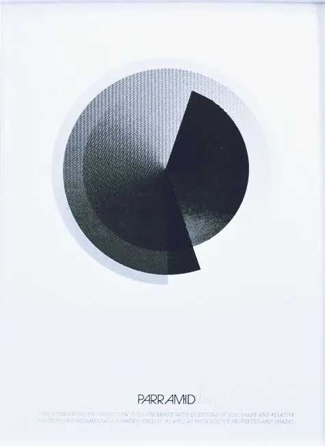
A geometric logo mark: a split circle with a solid dark semicircle and a light side filled with fine dotwork, creating tonal depth without color.
Summary
A split-circle logo using solid fill on one half and fine radiating dots on the other to create tonal contrast, with brand name "PARRAMID" typeset below.
Visual description
A circle divided vertically into two halves: the right half is a solid dark blue-black shape, while the left half shows the same form filled with hundreds of tiny dots that create a lighter, textured appearance. The contrast between the two halves builds visual interest through tonal density rather than color shifts. Below the mark sits the wordmark "PARRAMID" in a minimal serif or transitional typeface, with fine-print descriptive text beneath (legibility compromised in this view). The composition centers on a soft cream background with subtle cooling toward the top.
Key takeaway
The tonal-texture technique: use dot density to create depth and visual weight without introducing a second color. The symmetric split form creates immediate recognition and pairs opposing mark and wordmark elegantly. Minimal serif typesetting grounds a geometric mark without visual conflict.
Reuse notes
Ideal for brands seeking an abstract, sophisticated look that reads well at small scale and translates cleanly to single-color applications. The radiating pattern suggests movement, precision, or growth. Works across editorial, tech, and design-forward industries.