Preview image. Unlock full-res
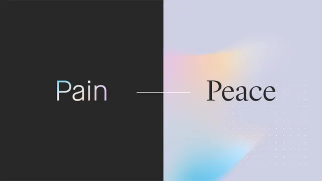
A conceptual logo split vertically into black (Pain) and pastel gradient (Peace), joined by a thin horizontal line, exploring psychological opposites through strict geometric duality.
Summary
A conceptual logo split vertically into black (Pain) and pastel gradient (Peace), joined by a thin horizontal line, exploring psychological opposites through strict geometric duality.
Visual description
Left half: solid deep charcoal-black background with cyan-accented, light-weight sans-serif "Pain" in white type, slightly raised. Right half: soft lavender-to-peachy gradient base with navy serif "Peace" type center-right. A single thin horizontal line bridges the two halves at the text baseline, signaling connection or balance. The right side shows a faint dotted pattern overlay, adding texture without breaking minimalism. The entire mark is a perfect vertical rectangle.
Key takeaway
The power of pure opposition: two words, two colors, one dividing line. The visual concept is immediately legible without explanation. The thin connective line bridges what appears irreconcilable, embedding the message in the form. Serif + sans pairing (Pain/Peace) subtly reinforces the contrast.
Reuse notes
Excellent for healthcare, wellness, therapy, mental-health, or rehabilitation brands. The duality is intellectually rigorous, not playful. Works well on white backgrounds; the soft gradient side needs careful contrast testing on dark. Best used large enough that the concept reads.