Preview image. Unlock full-res
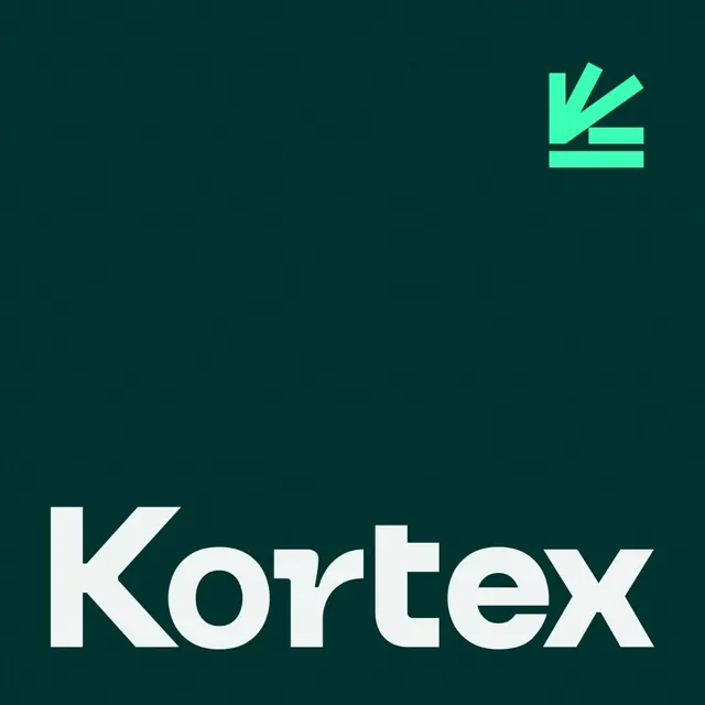
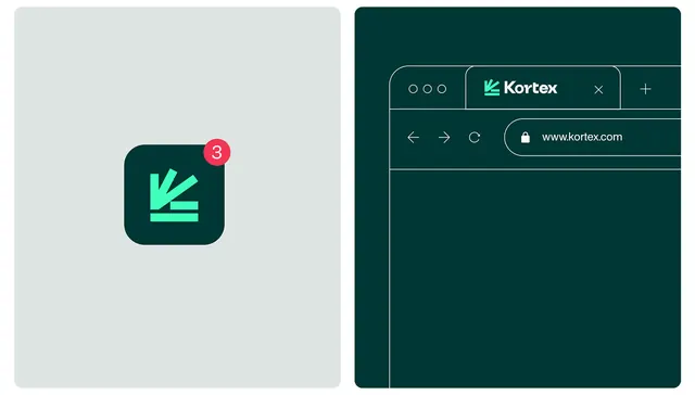
Kortex app identity pairing a deep-teal icon with a bright mint accent mark, shown alongside a teal browser interface mockup in a split-screen composition.
Summary
A product identity pairing a dark-teal rounded-square app icon with a bright mint slash accent, presented alongside a full-screen browser mockup in matching teal.
Visual description
Left side: rounded-square app icon on a pale gray background. The icon interior is deep teal with a geometric mark in bright mint green, composed of four diagonal slashes forming an abstract "K" or directional shape. A red notification badge with the number "3" appears in the top-right corner of the icon. Right side: a full browser window mockup on the same deep teal, showing a minimalist chrome area with three dots menu, a "Kortex" wordmark in white with the mint icon, a white navigation bar, and a lock-and-URL address field. The split composition demonstrates how the icon system scales and adapts across contexts.
Key takeaway
The bright accent (mint) against the dark teal background creates immediate visual pop and guides the eye. A geometric, directional mark that can work as both a logo and an icon is versatile across platforms. The notification badge demonstrates how the icon accommodates product feedback. Minimal chrome in the mockup reinforces a clean, focused interface.
Reuse notes
Effective for productivity, SaaS, or developer tools targeting a professional audience. The color combination (deep teal with mint accent) works particularly well for tech products suggesting trust and innovation. Test the accent color at smaller sizes to ensure it remains distinctive. Reserve the full wordmark for contexts where space allows; the icon should stand alone effectively.