Preview image. Unlock full-res
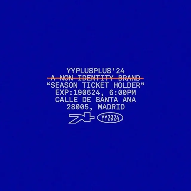
A deep royal blue ticket or poster with layered white and gold typography, promoting a non-identity brand event in Madrid.
Summary
A Madrid event ticket in stark blue and white typography, announcing VVPLUSPLUS'24 with white and gold-strikethrough text layers for an exclusive, premium season-pass impression.
Visual description
A full-bleed composition on deep royal blue (hex approximation 02069B). White sans-serif headlines in all-caps dominate the center: "VVPLUSPLUS'24" at top, with "A NON-IDENTITY BRAND" struck through in gold underneath. Below, quoted "SEASON TICKET HOLDER" and event logistical info (date, time, address in Madrid) in white capitals. A schematic mark and oval seal with "VY2024" sit below the type. The striking contrast and layering of white + strikethrough gold against the saturated blue creates formality and exclusivity without imagery.
Key takeaway
The deliberate use of strikethrough as a design element (not an error), asserting irreverence through rule-breaking. The color hierarchy white and gold on blue reads expensive and distinctive. The all-caps monospace-like presentation of facts (date, time, address) as part of the visual composition, not a footnote.
Reuse notes
Excellent for event/concert ticket design, season passes, or exclusive-membership announcements. Works in contexts where premium positioning trumps approachability. Gold accent on deep blue is particularly strong for luxury or artist-collective identities. Less suitable for friendly or welcoming contexts.
More like this





Keep what you find
A free account saves references to boards and can send you a weekly email of picks based on what you save.
To see every result, go Pro.