Preview image. Unlock full-res
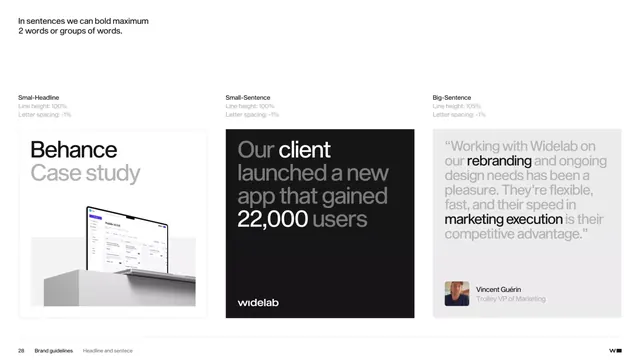
Typography specification sheet showing headline, body, and quote scales with precise line height and letter spacing rules for a corporate design system.
Summary
A brand typography spec page for Widelab showing three scale tiers (Smal-Headline, Small-Sentence, Big-Sentence) with precise line height and letter spacing metrics, each paired with real usage examples.
Visual description
White background divided into three vertical sections. Each column is labeled with a scale name and technical specs (line height %, letter spacing percentage). The left shows oversized black type reading "Behance Case study" above a mockup of a desktop interface. Center shows a dark background with oversized white type and gray text: "Our client launched a new app that gained 22,000 users" in white with gray supporting text. Right shows light background with a large quote: "Working with Widelab on our rebranding and ongoing design needs..." with full-width gray text below and a profile card (avatar + name "Vincent Guerin" + title) at the bottom. A rule and page footer label "Brand guidelines / Headline and sentence" anchors the spec.
Key takeaway
The pairing of abstract specs with concrete examples: the reader sees both the rules (line height, letter spacing percentages) and how they translate in real layouts. Dark/light contrast cases show versatility. The use of real case studies and testimonials integrates the type system into actual brand voice, not isolated specimens.
Reuse notes
Essential reference for teams documenting a type system at scale. The three-column layout efficiently packs scale, spec, and context together. Works for B2B and SaaS brands where precise technical documentation builds trust alongside visual polish. The "Headline and Sentence" paradigm (not H1/H2/H3) is more semantic and easier to apply to varied layouts.
More like this





Keep what you find
A free account saves references to boards and can send you a weekly email of picks based on what you save.
To see every result, go Pro.