Preview image. Unlock full-res
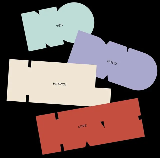
Four emotionally charged words ("Yes," "Good," "Heaven," "Love") sit in organic, overlapping pastel shapes (mint, lavender, cream, coral) against a black void.
Summary
Four emotionally charged words sit in organic, overlapping pastel shapes against a black void, arranged to balance rhythm and visual rest.
Visual description
Four soft geometric shapes with jagged, torn-edge contours cascade diagonally across a black background, each holding a single word in clean sans-serif: "Yes" in mint teal, "Good" in lavender, "Heaven" in cream, "Love" in warm coral-red. The overlapping arrangement creates rhythmic movement without chaos. The pastel palette against pure black maximizes contrast while maintaining a calm, meditative tone. Negative space plays a key role, isolating each shape and allowing the eye to rest between words.
Key takeaway
The pairing of organic, soft shapes with angular jagged edges creates visual interest without hardness. Positive emotional language set in neutral typography becomes the design move itself, not the styling. The color harmony (adjacent pastels with high-contrast black) feels both soothing and sophisticated.
Reuse notes
Strong for wellness, mental health, therapy, or brand voice projects seeking warmth without sentimentality. The torn-edge technique works for product packaging, social content, and print collateral. Replicates well when negative space (the black) is generous and text is minimal.
More like this



Keep what you find
A free account saves references to boards and can send you a weekly email of picks based on what you save.
To see every result, go Pro.