Preview image. Unlock full-res
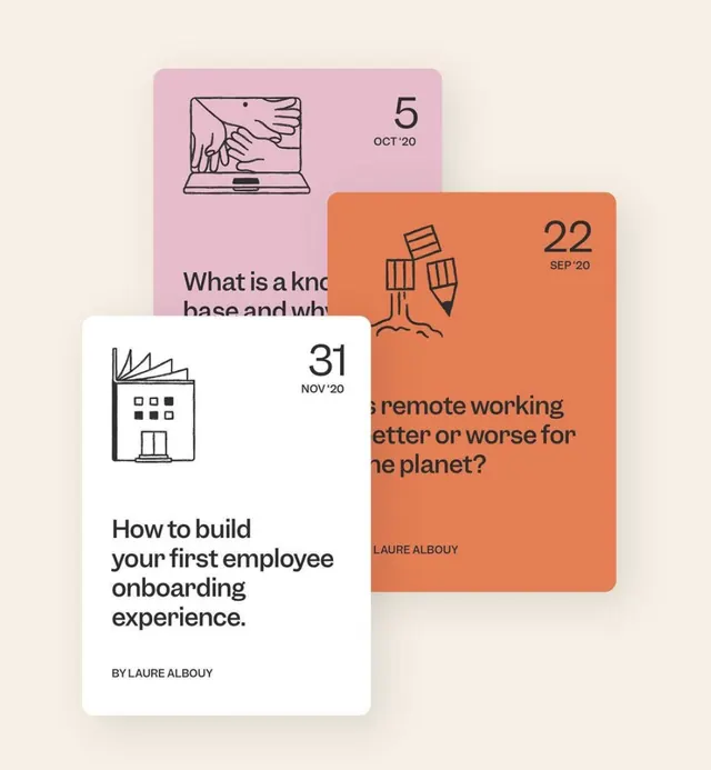
A four-card branding mockup pairing pastel and warm tones with minimalist line-art icons and dated entries on a neutral cream ground.
Summary
A four-card layout pairing pastel pink and terracotta tones with minimalist line-art icons, dates, and sans-serif headlines on a cream ground.
Visual description
Four rectangular cards scattered across a warm cream background, each positioned at a different angle to suggest a loose, editorial arrangement. The cards vary in color: pale pink, terracotta orange, and white. Each card contains a small line-art icon (laptop with hand, beer glasses, building, and a scattered layout element) positioned in the upper left. A large serif-and-sans-serif date sits in the upper right (OCT 5, SEP 22, NOV 31, etc.). Below the icon is a three- to four-line sans-serif headline in a darker color (navy or black), followed by byline attribution in smaller type. The cards use high contrast between text and background and maintain consistent grid-based structure despite the scattered composition. The overall palette is warm and sophisticated, avoiding both bright neon and muted tones.
Key takeaway
The deliberate tension between structured card layout and scattered, free arrangement. The pairing of a single icon per card with a clean date-stamp creates immediate scanability and establishes a calendar or timeline system. The restrained two-color palette per card (color background plus black text) is repeatable and modular.
Reuse notes
Perfect reference for editorial calendar design, event promotion series, blog post previews, or educational module cards. The scattered layout works well for print and digital applications where individual content blocks need to stand alone but part of a larger system. The ratio of white space within each card to colored ground is worth studying for balance.
More like this
Keep what you find
A free account saves references to boards and can send you a weekly email of picks based on what you save.
To see every result, go Pro.