Preview image. Unlock full-res
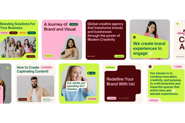
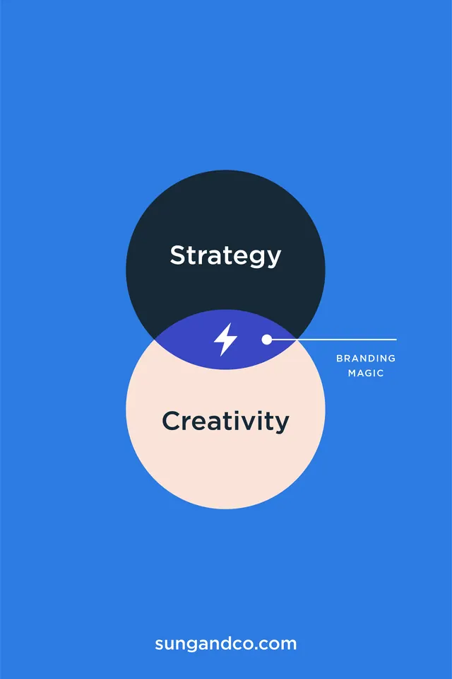
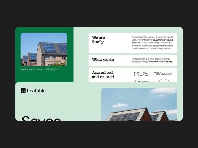
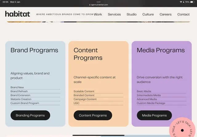
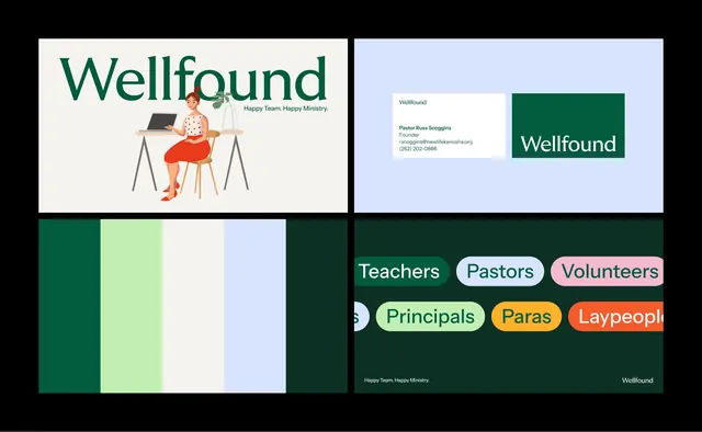
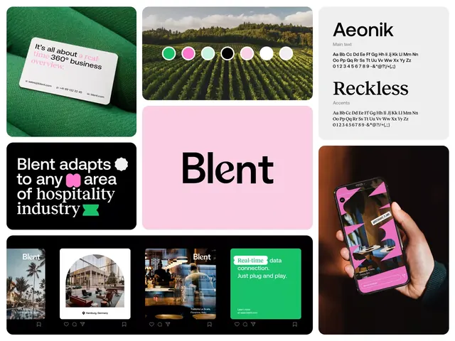
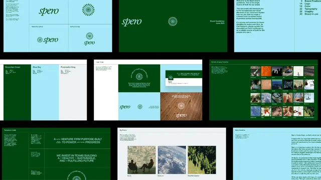
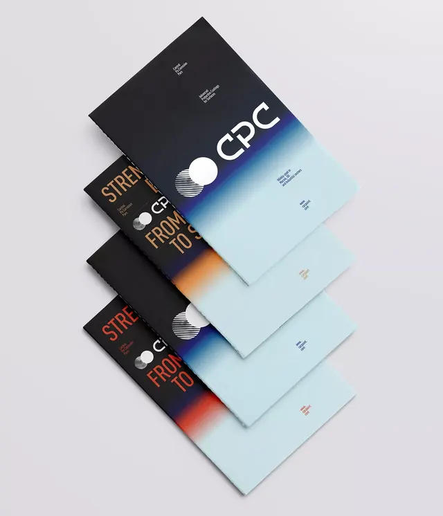
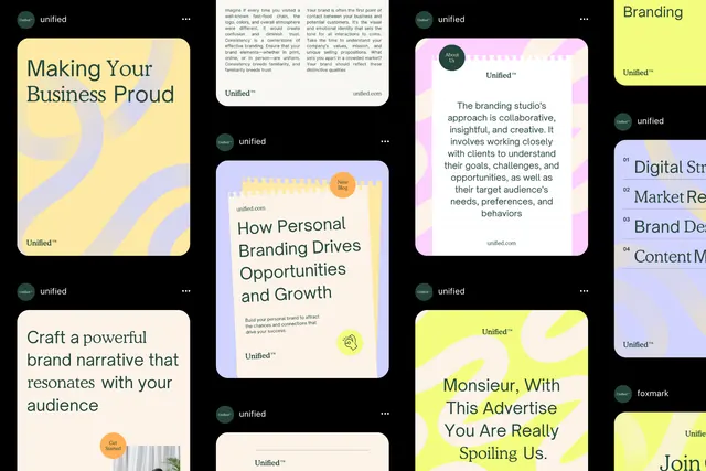
A grid of pastel-colored content cards showcasing branding concepts, each combining typography, photography, and editorial messaging in a cohesive visual language.
Summary
A multi-card branding system arranged in a grid, each card pairing a distinct pastel background with typography, imagery, or editorial content to form a cohesive visual identity guide.
Visual description
Organized in a 2x3+ grid, the composition displays square and rectangular cards in soft pastels: pale yellow, lavender, pale mint, off-white. Each card contains black sans-serif copy (titles like "Making Your Business Proud", "How Personal Branding Drives Opportunities and Growth", "Craft a powerful brand narrative that resonates with your audience") paired with illustration or photography vignettes. A small "untitled" logo mark appears in the upper corner of some cards. One card features a warm orange circular illustration element. The overall aesthetic is spacious, with typography aligned top-left or center. The black text and colored backgrounds create clear readability and a premium, crafted feeling.
Key takeaway
The pastel palette creates trust and approachability without sacrificing sophistication. Pairing each color with a distinct message or guideline section allows a brand system to feel cohesive yet diverse. The use of illustrated accents (circles, organic shapes) softens the corporate structure. Grid layouts emphasize consistency and professionalism.
Reuse notes
Ideal for building a brand-guidelines deck, marketing collateral, or service offering overview. Works best with clear, short editorial copy to maintain scanability. The pastel color combinations are particularly strong for creative services, SaaS, wellness, or lifestyle brands aiming for a modern-yet-accessible tone.