Preview image. Unlock full-res
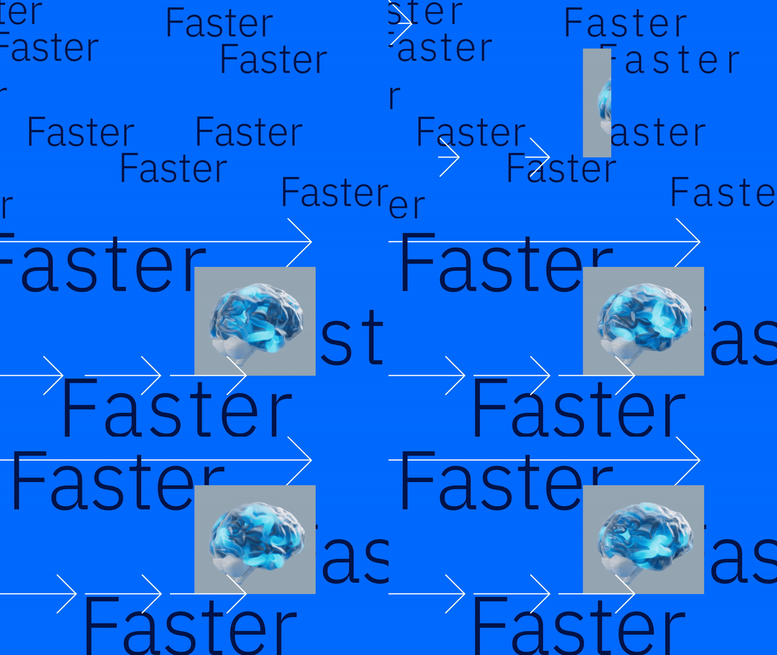
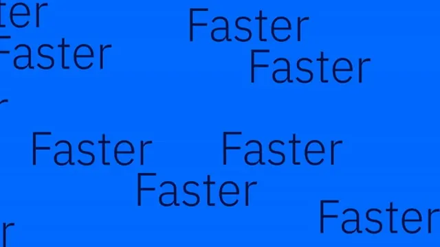
The word 'Faster' repeated across a bright blue background in a clean sans-serif display face, scattered in a distributed pattern to create rhythm through repetition.
Summary
A type specimen showing the word "Faster" repeated and distributed across a bright blue background to demonstrate a clean sans-serif display face and create visual texture through typographic rhythm.
Visual description
Multiple instances of the word "Faster" in black sans-serif type scattered across a bright electric-blue field in a non-uniform, organic distribution. The repetition covers roughly 60 percent of the frame, with instances varying in size and position to suggest motion or urgency. The typeface has a geometric, modern character with clean strokes and even weight. The composition relies entirely on the interplay between positive (text) and negative (blue) space, creating a dynamic sense of pattern without relying on any other visual elements.
Key takeaway
Repetition creates visual interest and establishes typographic texture; scattering at varying scales (rather than a strict grid) feels organic and energetic; a single bright color paired with black text maximizes contrast and readability while maintaining simplicity; this approach conveys urgency and speed through pure typography.
Reuse notes
Effective for tech products, performance brands, or apps emphasizing speed. Works well as a background pattern, hero section texture, or type-specimen showcase. The monochromatic blue and black palette is flexible for different brand contexts. Scale and spacing can be adjusted to create more or less visual noise depending on the desired energy level.
More like this



Keep what you find
A free account saves references to boards and can send you a weekly email of picks based on what you save.
To see every result, go Pro.