Preview image. Unlock full-res
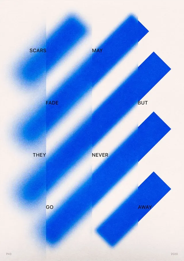
Type specimen with word fragments placed over diagonal blue bars, some soft-blurred and one sharp, demonstrating texture progression.
Summary
Type specimen layout with short word fragments positioned over diagonal blue bars, mixing sharp and soft-focus treatments to show texture variation.
Visual description
Off-white background with five diagonal bars angled left-to-right in saturated blue. Each bar hosts a two-letter or three-letter word in black, all-caps sans-serif: SCARS, MAY, FADE, BUT, THEY, NEVER, GO, AWAY. The leftmost bar has a soft Gaussian blur, creating a hazy wash effect. Middle bars are rendered sharp and solid. Rightmost bars are again crisp. The staggered placement of blue rectangles creates a sense of downward progression and movement. A small identifier "P43" appears bottom-left; "2020" sits bottom-right. The composition uses negative space effectively, with bars angled approximately 45 degrees.
Key takeaway
The blur-to-sharp gradient demonstrates a material or temporal concept (fading to permanence) without narration. Diagonal orientation creates visual momentum and breaks static layouts. Fragmenting a phrase across bars forces the viewer to read sequentially, extending engagement.
Reuse notes
Strong for editorial, poster, or campaign work where type needs to convey motion or emotional arc. The blur effect works well at medium-to-large scales. The all-caps treatment pairs with brands seeking bold, confident presence. The 2020 date and archival identifier suggest this works as portfolio documentation or student work.
More like this


Keep what you find
A free account saves references to boards and can send you a weekly email of picks based on what you save.
To see every result, go Pro.