Preview image. Unlock full-res
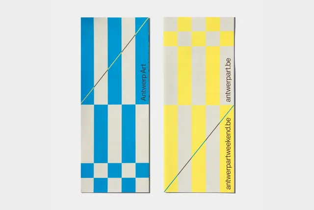
Minimalist type specimen arranged on a grid of vertical color stripes in bright blue, yellow, and white, emphasizing geometric structure and contrast.
Summary
Minimalist type specimen arranged on a grid of vertical color stripes in bright blue, yellow, and white, emphasizing geometric structure and contrast.
Visual description
Vertical stripes of equal width fill the horizontal space, alternating between cyan blue, bright yellow, off-white, and light gray. Type elements (letterforms and numbers) are overlaid across these stripes in a sans-serif, geometric weight, rendered in black or white for legibility. Elements are positioned at intervals with mathematical precision. The overall composition reads as a series of color blocks interrupted by functional typography, with no ornament or secondary imagery. The effect is technical and systematic.
Key takeaway
The use of stripes as both background pattern and compositional grid for type placement. The color contrast system that relies on limited primaries (blue, yellow) rather than variety. The mathematical spacing that creates rhythm without becoming repetitive. The functional approach to type where legibility drives placement, not decorative whim.
Reuse notes
Excellent for tech brands, packaging, or graphic design studios wanting to signal precision and systematic thinking. The primary colors read as contemporary and confident without being playful. Works best paired with clean, geometric sans-serif typefaces. Use when the audience expects order and technical credibility rather than warmth or personality.
More like this




Keep what you find
A free account saves references to boards and can send you a weekly email of picks based on what you save.
To see every result, go Pro.