Preview image. Unlock full-res
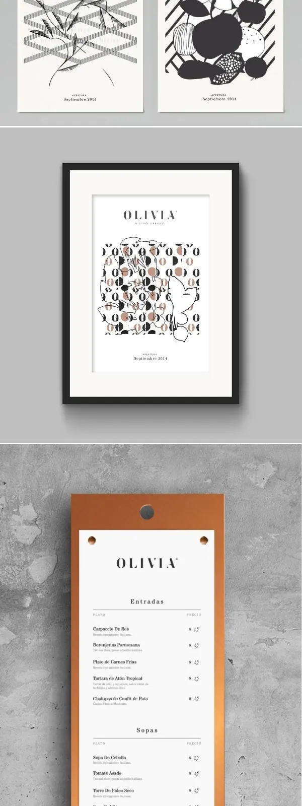
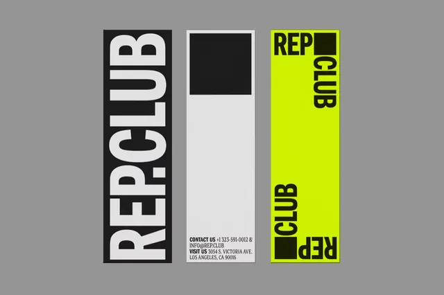
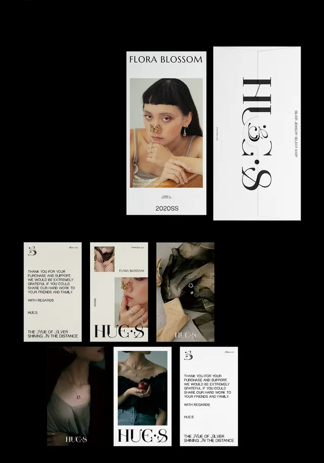
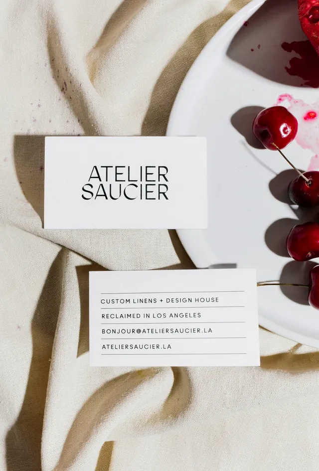
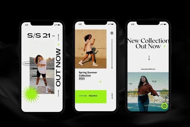
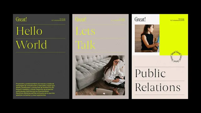
A three-panel brand identity presentation uses large serif headlines, neon yellow accents, and inset photography on dark, neutral, and light backgrounds.
Summary
A three-panel brand identity presentation uses large serif headlines, neon yellow accents, and inset photography on dark, neutral, and light backgrounds.
Visual description
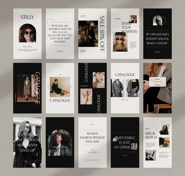
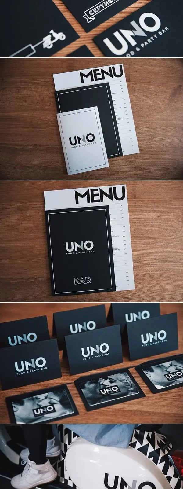
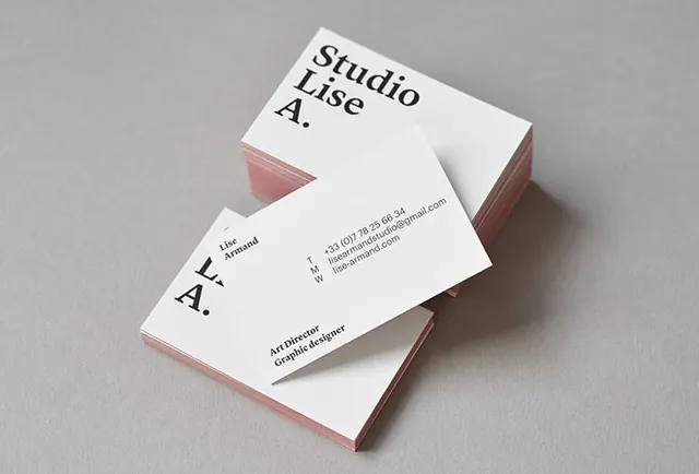
The image shows three vertical presentation panels arranged side by side on a black background. Each panel contains a large serif headline, thin divider lines, small corner text, and either a photo or solid color block in a restrained editorial layout.
Key takeaway
Use oversized serif type with lots of breathing room, then punctuate it with one loud accent color for emphasis. Pair that with thin rules and small corner labels to make the composition feel like a premium brand system.
Reuse notes
This works well for agency branding, pitch decks, and identity moodboards where you want a polished editorial feel. Reach for it when the goal is to make simple content feel designed without adding decorative complexity.