Preview image. Unlock full-res
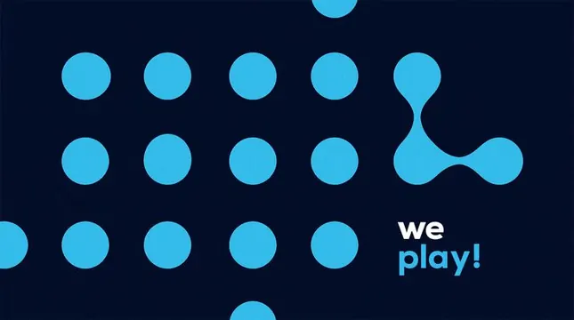
Tech-forward identity combining a grid of bright cyan circles with a flowing organic blob and light-cyan body copy on a deep navy ground.
Summary
A modular identity system combining stacked rows of uniform cyan circles with a fluid organic blob mark and direct "we play!" copy in sans-serif, all on deep navy, balancing rigid geometry with flowing forms.
Visual description
Deep navy background with a grid-like composition. At left and bottom, neat rows of identical bright cyan circles arranged in a grid (approximately 4 columns and 3 rows visible). At right, a flowing organic blob shape formed by overlapping curved forms, suggesting motion or fluidity. Below the grid, light cyan sans-serif body copy reads "we play!" with "we" in white and "play!" in cyan. The typography is clean, geometric, and right-aligned. Overall the composition balances structured modularity on the left with organic, flowing abstraction on the right, creating visual tension between precision and play.
Key takeaway
A hybrid mark system that uses both rigid geometry (circles) and organic flow (blob) to simultaneously communicate order and playfulness. The modular circle grid is a flexible building block useful at any scale or composition. The strong navy-to-cyan color contrast provides high legibility and tech credibility while remaining approachable.
Reuse notes
Ideal for tech, developer tools, or consumer apps targeting creative or playful positioning. The modular circles can expand or contract for responsive contexts. Cyan on navy works well at small and large scales. The organic blob adds movement and breaks rigidity without compromising minimalism.