Preview image. Unlock full-res
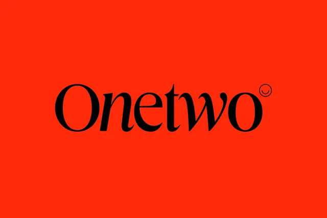
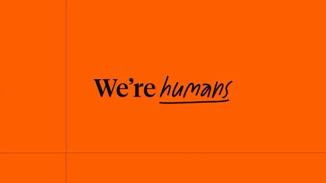
A full-bleed, vibrant-orange background with hand-drawn serif lettering stating 'We're humans', combining warmth with stark simplicity.
Summary
A full-bleed, vibrant-orange background with hand-drawn serif lettering stating 'We're humans', combining warmth with stark simplicity.
Visual description
A split composition bisected by a thin vertical line. The left side is a bright, saturated orange-red filling the entire frame. The right side is pure orange at the same hue. Centered in the middle sits the phrase 'We're humans' in a large, friendly hand-drawn serif typeface with a dark brown or black stroke. The word 'humans' is italicized and underlined with a thick hand-drawn stroke, emphasizing the conversational tone. The letterforms have slight irregularities typical of handwriting but maintain strong legibility. No other design elements, no additional color, no graphics. The total effect is bold, direct, and disarming through its simplicity.
Key takeaway
The power of a single, handwritten statement against a solid, high-saturation background to communicate brand personality. Hand-drawn type as a humanizing device that softens what might otherwise be a corporate message. The underline as emphasis, applied with gesture rather than a precise design tool. The boldness of full-bleed color choice that leaves no room for distraction.
Reuse notes
Effective for brands with a human-first or values-driven positioning, especially tech, nonprofits, or consumer brands. The handwriting style reads as approachable and genuine rather than corporate. Works well as a hero or key campaign asset. Caution: the orange is very saturated, so ensure it pairs well with your secondary brand colors. The simplicity limits extensibility, so better as a focal statement than a modular identity system.