Preview image. Unlock full-res
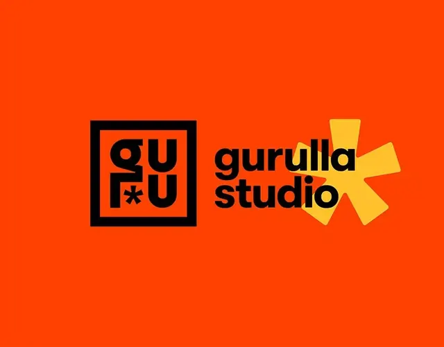
A vibrant orange brand identity combining a black boxed monogram and geometric sans-serif wordmark with a dynamic yellow angular graphic accent.
Summary
A cohesive design studio identity combining a black-outlined monogram badge with a geometric sans-serif logotype and a dynamic yellow angular graphic that evokes energy and forward motion.
Visual description
Against a saturated orange background, the left side features a bold black-outlined square containing the monogram "gu" stacked vertically with a special character divider, using a modern sans-serif. Adjacent to the right is the full wordmark "gurulla studio" in lowercase geometric sans-serif, bold weight, in black. To the far right, a dynamic yellow angular shape (resembling a rotated compass or directional mark) provides a kinetic accent. The composition is horizontally balanced with the monogram/wordmark on the left two-thirds and the graphic accent breaking into the right third, creating forward visual momentum.
Key takeaway
The strategy of a self-contained monogram badge paired with a longer wordmark, allowing flexibility for applications (use the square alone or with the full mark). The bright, energetic color system (orange-black-yellow) as a memorable, repeatable identity. The geometric graphic accent as a secondary brand element that reads as purposeful, not decorative.
Reuse notes
Ideal for design studios, creative agencies, or modern brands needing both icon and logotype flexibility. The bold geometric aesthetic skews contemporary and confident. Works well in digital contexts (web, social, UI) and print. The saturated orange background is high-energy; test it on secondary brand applications to avoid fatigue. The monogram is strong enough to stand alone at small scales or app icons.
More like this




Keep what you find
A free account saves references to boards and can send you a weekly email of picks based on what you save.
To see every result, go Pro.