Preview image. Unlock full-res
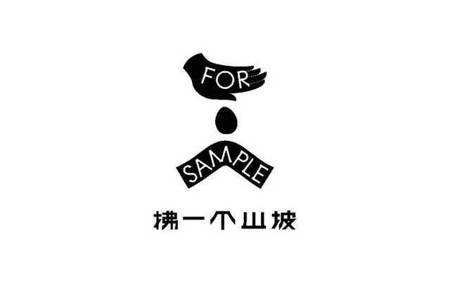
A symbolic, hand-shaped motif with integrated text forms a compact, bilingual wordmark combining English and Chinese characters.
Summary
A minimalist symbol combining a stylized hand with integrated typography and bilingual text (English "FOR SAMPLE" and Chinese characters), creating a unified mark.
Visual description
A vertical composition centered on white. At top, a hand or glove silhouette with "FOR" embedded in the white counterspace. Below, a circular dot, then "SAMPLE" angled across two rectangular bars. Below that, Chinese characters. All elements are solid black with clean, sharp edges. The layout is tightly vertically stacked with equal spacing, exploiting negative space to integrate text within the hand form and create visual hierarchy.
Key takeaway
Using a hand or body shape as a typographic container to merge imagery and word. The centered vertical axis and pure black/white create instant brand presence. The bilingual approach suggests international or design-studio identity.
Reuse notes
Strong for creative, design-forward, or international brands needing a compact, memorable icon. The hand gesture hints at craft, interaction, or human touch. Works well at small scale (favicon, app icon) and maintains clarity at large scale. Not suited to colorful palettes; black and white is the entire concept.