Preview image. Unlock full-res
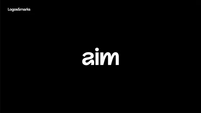
Monochrome wordmark for 'aim' in rounded sans-serif, anchored by a dot mark, displayed on black background with 'Logos&marks' label.
Summary
Monochrome wordmark for 'aim' in rounded sans-serif with an accent dot, presented on a black field with a source-gallery credit line above.
Visual description
The wordmark "aim" is rendered in a rounded, geometric sans-serif typeface with letterforms that taper slightly at the terminals, creating visual movement. A circular mark sits above the "i" like a traditional dot but with intentional visual weight. The full mark is white against a pure black background, centered in the lower half of the composition. Above the mark, "Logos&marks" appears as a small label in the same sans-serif, anchoring the gallery attribution. Tight letter spacing creates a compact, unified glyph.
Key takeaway
The dot-as-mark technique adds personality to an otherwise minimal wordmark without compromising clarity. The rounded geometric sans-serif softens minimalism while maintaining technical precision. Black-on-white reversal and centered composition create confident, direct presentation suitable for direct mail or digital applications.
Reuse notes
Strong for tech startups, productivity apps, or forward-thinking brands seeking a friendly but professional mark. Works well at small sizes due to generous internal spacing and clear counterforms. Pairs effectively with extended letter-spacing in supporting typography. The rounded proportions read as modern and approachable, less austere than purely geometric marks.