Preview image. Unlock full-res
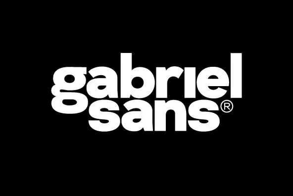
A modern sans-serif wordmark for 'gabriel sans' set in a bold, geometric typeface on black; registered trademark sits inline, emphasizing typography as the sole design system element.
Summary
A specimen of the Gabriel Sans typeface set as a wordmark in all lowercase on black, with the registered mark positioned inline; geometric proportions and generous letter spacing emphasize type fundamentals.
Visual description
Two lines of white text on a black background: "gabriel sans" in a bold, geometric sans-serif with the registered trademark symbol positioned to the right of "sans" at cap height. The typeface is full-weight with generous tracking, allowing each letterform to breathe individually. The letterforms are constructed from clean, simple strokes with minimal stroke contrast, and the counters are open and generous. No additional graphics, textures, or color—the entire design is monochromatic, allowing the typeface itself to be the sole visual component.
Key takeaway
Lettersetting as a complete identity statement: no mark, no secondary typeface, no color variation needed. The generous tracking and bold weight on high-contrast background make the typeface readable and impactful at almost any scale. The positioning of the registered mark directly inline rather than as a superscript feels modern and intentional.
Reuse notes
Perfect as a specimen for a display or headline typeface, or as a wordmark for design-focused brands wanting to lead with typography. The stark black-and-white treatment is gallery-appropriate and works on business cards, digital platforms, and signage. Not suited for warm or playful brands. The bold weight reads as premium and professional; avoid where approachability or diversity is a brand priority.
More like this



Keep what you find
A free account saves references to boards and can send you a weekly email of picks based on what you save.
To see every result, go Pro.