Preview image. Unlock full-res
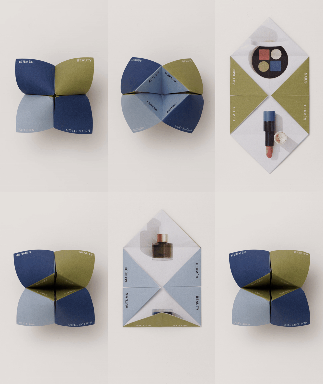
Four-panel folded stationery or packaging design in muted earth tones with serif and sans-serif typography labeling each colored section.
Summary
Four-panel folded stationery or packaging design in muted earth tones with serif and sans-serif typography labeling each colored section.
Visual description
A cream-white card or booklet shown folded into four visible panels. Each section is filled with a distinct muted color: warm beige, soft olive-gray, cool slate blue, and sand. Small serif or sans-serif labels sit in the upper-left of each panel in charcoal or black type. The fold lines are clean and sharp, emphasizing the geometric division. The overall finish reads tactile and premium, with careful attention to color harmony across the muted palette.
Key takeaway
The four-panel folding structure as an efficient container for a branded stationery system. Muted-tone blocking (cream, olive, slate, sand) creating visual interest without saturation. Minimal labeling approach (single word per section) allowing the color to speak. The card format as a compact portfolio or packaging insert.
Reuse notes
Ideal for luxury product packaging, stationery suites, or portfolio cards. The muted palette suits heritage, fashion, or crafted-goods brands. Works well as a business-card insert, product sample container, or promotional mailer. Pairs well with natural materials (kraft, uncoated stock) and minimal branding; the fold and color do the visual work.
More like this








Keep what you find
A free account saves references to boards and can send you a weekly email of picks based on what you save.
To see every result, go Pro.