Preview image. Unlock full-res
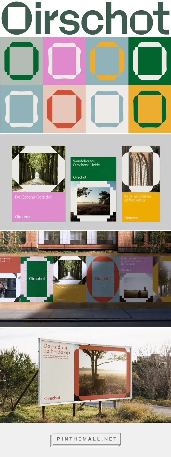
Structured mood board combining a modular grid of colored frames with interior photography and product shots, demonstrating a coordinated earthy palette across spaces.
Summary
A modular color mood board stacking a grid of colored frames (teal, pink, mustard, dark green), interior photography, and product shots to show how a coordinated earthy palette works across built spaces.
Visual description
The design stacks three zones vertically. Top: the "Dirschot" wordmark in bold sans-serif, followed by a grid of four colored frames in teal, pink, mustard, and dark green, each holding interior or object photography. Middle: larger paired photographs of spaces and products in the same color tones. Bottom: a row of actual paint/material color swatches aligned horizontally, grounding the palette in tangible finishes. The overall composition is grid-locked and highly modular, with each frame treated as a discrete unit. Off-white space between elements emphasizes the precision and thoughtful curation.
Key takeaway
The stacked-zone approach to mood boards: frames at top, applications in the middle, material swatches at bottom. This signals how abstract colors translate into real spaces. The modular grid rhythm establishes visual authority and makes the palette feel coherent and designed, not accidental.
Reuse notes
Ideal for interior, real-estate, or furniture brand identity work where color choices must feel coordinated across products and spaces. The swatch row at bottom is especially useful for designer presentations. Works best when you have actual product/space photography that shares the palette; weaker if used with generic stock imagery.
More like this




Keep what you find
A free account saves references to boards and can send you a weekly email of picks based on what you save.
To see every result, go Pro.