Preview image. Unlock full-res
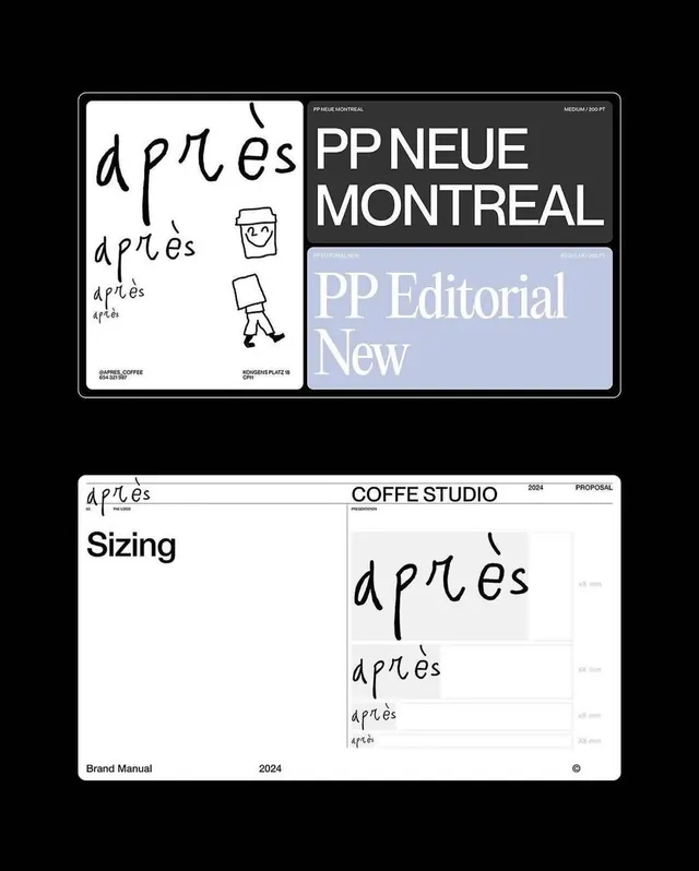
Two-panel brand manual showing a casual handwritten script logotype, typographic system, and sizing specifications for Apres, a coffee studio brand identity.
Summary
Brand identity documentation for Apres Coffee Studio showing a playful handwritten logotype alongside systematic sizing specifications and editorial typography spreads on a monochrome color palette.
Visual description
The image displays two brand manual pages. The top panel shows a split layout: on the left, white paper bears the "apres" logotype in casual, sketchy handwriting with small illustrations of a coffee cup and stick figure. The right side features a dark gray panel with "PP NEUE MONTREAL" in bold sans-serif alongside "PP Editorial New" in a lighter serif font. Below on white paper are sizing specifications labeled "Sizing" for the Apres mark at multiple scales descending in size, printed in black on white. The bottom section is labeled "Brand Manual 2024 PROPOSAL" with "COFFEE STUDIO" in clean sans-serif. All elements use crisp black, white, and cool grays with minimal spacing and a modular grid structure.
Key takeaway
The contrast between a loose, hand-drawn logotype and rigorous systematic documentation creates personality within professional rigor. The split monochrome palette (black on white, white on dark gray) maximizes contrast for clarity while maintaining elegance. Sizing specifications shown actual-scale or proportionally aid production consistency. The casual serif serif type paired with geometric sans-serif suggests both hospitality and modern precision.
Reuse notes
Strong reference for food, beverage, or small-batch product branding that wants warmth without sacrificing professionalism. The handwritten mark works because it is supported by systematic documentation; do not skip the specs. Effective for cafe, restaurant, or artisanal food brands. The cool color palette keeps it sophisticated; would benefit from a warm accent color in implementation. Good template structure for anyone designing a brand identity system from scratch.
More like this




Keep what you find
A free account saves references to boards and can send you a weekly email of picks based on what you save.
To see every result, go Pro.