Preview image. Unlock full-res
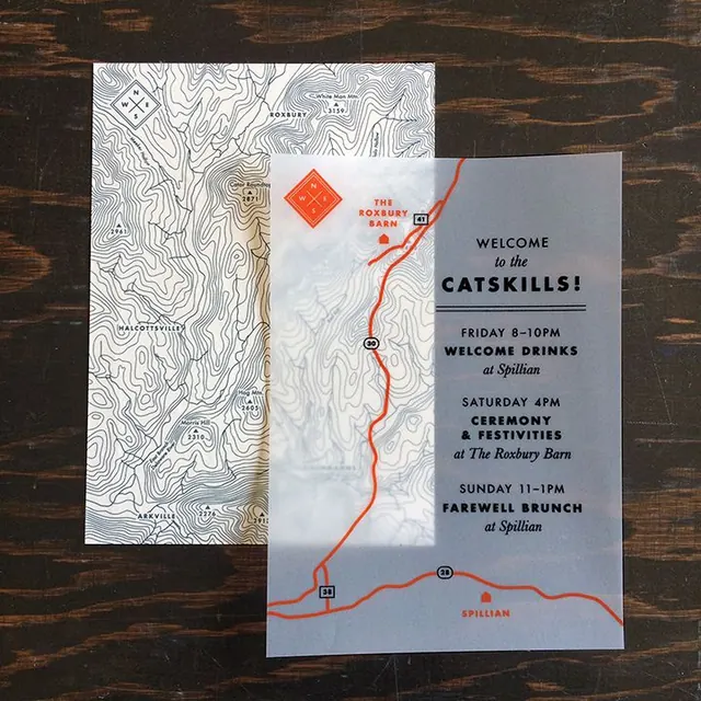
An event invitation pairing a hand-drawn topographic map with a structured information card, unified by a bold orange route line and pastel accent colors.
Summary
A two-part event invitation uniting a detailed topographic line-art map with an event-details card, connected by an orange route line and warm earth-tone accents.
Visual description
The left panel is a full topographic contour map rendered in fine line-art, hand-drawn in style, with location markers and wayfinding symbols anchoring specific points (Roxbury, Spillian). The right panel shifts to a slate-blue info card with "Welcome to the CATSKILLS!" in bold sans-serif display type, listing three event dates and venues (Friday welcome drinks, Saturday ceremony, Sunday brunch). An orange line ties the two panels together, tracing a route across the map and bleeding into the right card as a visual connector. Small red diamond markers echo the route on both the map and info card. Accent colors (orange, red, pale mint green on one variant) sit against neutral off-white, black, and grey, creating a warm-yet-restrained feel that reads as both rustic and refined.
Key takeaway
The device of a hand-drawn map as a visual anchor paired with structured typography solves the dual challenge of wayfinding and information hierarchy. The orange route line is a minimal but powerful connector between two separate information systems, making the invitation memorable and functional. The topographic aesthetic immediately signals outdoor/location-based event without needless illustration.
Reuse notes
Ideal for hospitality events, destination weddings, or outdoor venue invitations where geography is part of the draw. The map-plus-info structure allows attendees to understand location in context. The warm color palette and hand-drawn map feel personal without being precious; it works at postcard and digital scales alike. The line-art approach keeps production costs low while maintaining sophistication.
More like this



Keep what you find
A free account saves references to boards and can send you a weekly email of picks based on what you save.
To see every result, go Pro.