Preview image. Unlock full-res
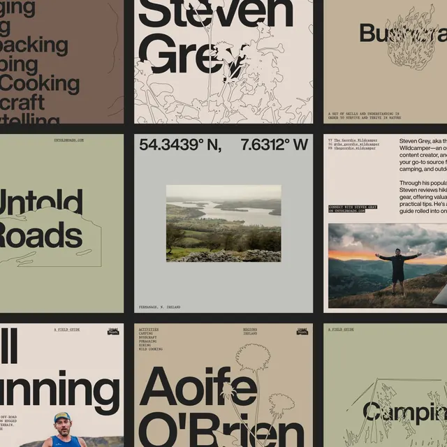
Fragmented multi-panel branding system combining typography, hand-drawn maps, landscape photography, and line illustrations for an outdoor adventure guide brand.
Summary
Fragmented multi-panel branding system combining typography, hand-drawn maps, landscape photography, and line illustrations for an outdoor adventure guide brand.
Visual description
A grid of nine unequal panels showcasing different design applications: partial word fragments and category names ("Cooking", "Backing") in a serif display face on earth-toned backgrounds; large bold letterforms ("Steven Grey") crossing panel breaks; hand-drawn botanical line art of flowers and shrubs on cream paper; landscape photography of a rolling green valley with coordinates displayed below ("54.3439 degrees N, 7.6312 degrees W"); a field guide header; a sunset photograph of a silhouetted person with arms raised against mountains; and text describing the designer/concept. Typography mixes bold sans-serif display type with smaller body copy and hand-written annotations. The overall palette is warm and earthy, dominated by sage green, cream, dark olive, and black. No vibrant colors; all restraint and authenticity.
Key takeaway
The use of fragmented composition across multiple panels to showcase various applications while maintaining visual cohesion through consistent typography and color palette. Hand-drawn elements (maps and botanical work) authenticity mixed with professional photography creates a tactile, exploratory brand personality. The coordinate display and field-guide conventions anchor the identity in real geography and outdoor practicality rather than abstraction.
Reuse notes
Strong template for outdoor, travel, adventure, and nature-focused brands; also works for heritage, cultural heritage, or eco brands that need to feel grounded and regionally specific. The grid-panel system makes it flexible for both print applications and web case studies. The monochrome palette with warm earth tones is forgiving and scales down cleanly.
More like this

Keep what you find
A free account saves references to boards and can send you a weekly email of picks based on what you save.
To see every result, go Pro.