Preview image. Unlock full-res
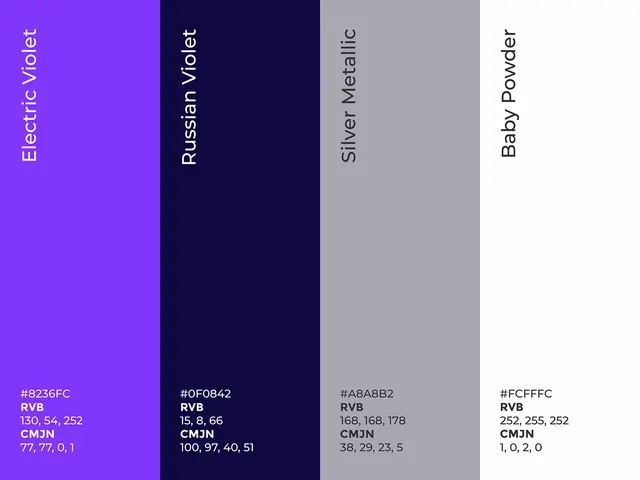
A four-color palette specimen moving from bright electric violet through deep navy and muted silver metallic to warm baby powder, with RGB and CMYK breakdowns for each swatch.
Summary
A four-color palette specimen moving from bright electric violet through deep navy and muted silver metallic to warm baby powder, with RGB and CMYK breakdowns for each swatch.
Visual description
Four vertical color bands of equal width, each occupying one quarter of the frame. Left to right: bright electric violet (#8236FC), deep navy-blue (#0F0842), cool gray-silver (#A8A8B2), and off-white powder (#FDFEFC). Each swatch is labeled with a color name rotated vertically along the top edge (Electric Violet, Russian Violet, Silver Metallic, Baby Powder). Below each swatch sits technical data: hex value, RGB triplet, and CMYK breakdown, all set in a small monospace sans-serif. The layout is purely functional and grid-based, emphasizing precision and technical accuracy.
Key takeaway
The pairing of two nearly-opposite cool hues (violet and navy) with a neutral metallic gray and warm white creates visual interest while remaining cohesive. The contrast between the vibrant accent and the muted supporting colors is suitable for brands wanting to balance energy with restraint.
Reuse notes
Ideal as a reference for tech or creative brands seeking a modern, slightly luxe color story. The cool undertones and small amount of warmth (baby powder) work well for SaaS, design tools, or fashion brands. The inclusion of both RGB and CMYK values makes this particularly useful for cross-media workflows (digital and print).
More like this







Keep what you find
A free account saves references to boards and can send you a weekly email of picks based on what you save.
To see every result, go Pro.