Preview image. Unlock full-res
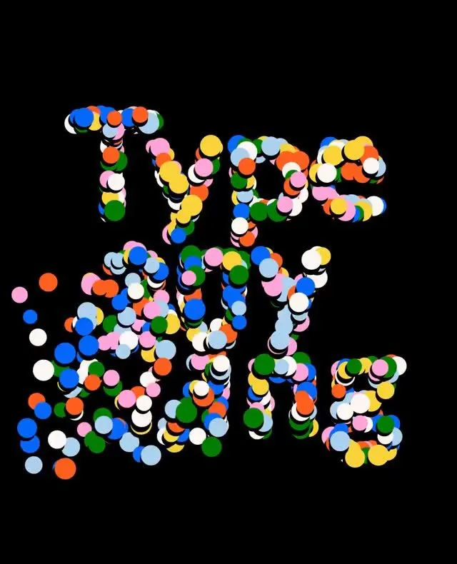
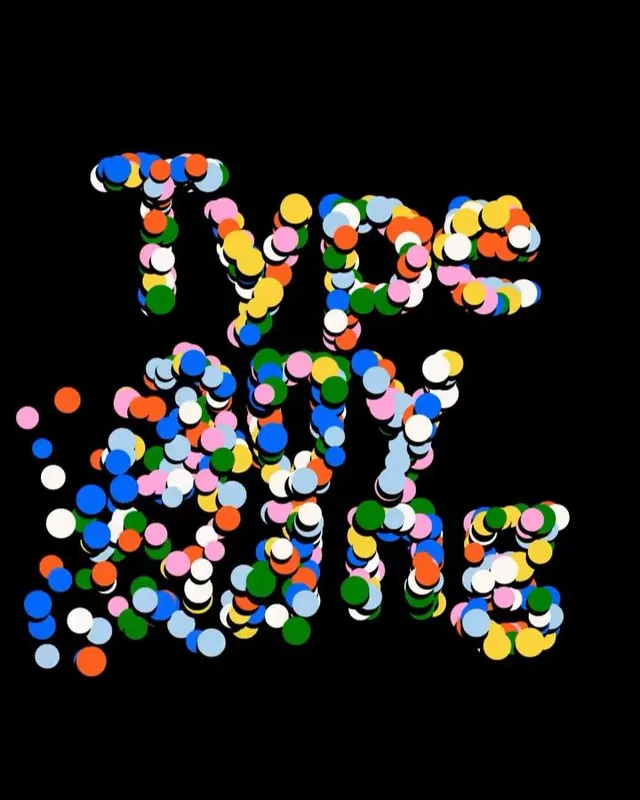
The word TYPE rendered as bold letterforms composed of tightly packed, overlapping circles in primary and secondary colors against a black background.
Summary
A graphic poster lettering "TYPE" using tight clusters of colored circles as the building blocks of each letter, creating a maximalist, kinetic word-mark against black.
Visual description
Four bold letters rendered from hundreds of small circles tightly packed and overlapping. The circles use bright primary colors (royal blue, orange, yellow, green, pink, white) distributed across all four letterforms. Against a pure black background, the circles create distinct letter shapes through their collective boundary. The treatment is dense and optically vibrant, with colors mixing optically where circles overlap. Soft drop shadows on individual circles add subtle depth and dimension.
Key takeaway
The circle-composition technique as a system for building energetic letterforms. The color distribution across the mass creates figure-ground clarity without stroke outlines. The tightness of spacing between circles forces the eye to read the overall letter shape rather than individual marks.
Reuse notes
Ideal for posters, album covers, creative branding requiring maximum visual impact. Works as a display technique or standalone wordmark for playful, youth-facing brands. The black background is essential for pop; light or white backgrounds would muddy the color reading.
More like this
Keep what you find
A free account saves references to boards and can send you a weekly email of picks based on what you save.
To see every result, go Pro.