Preview image. Unlock full-res
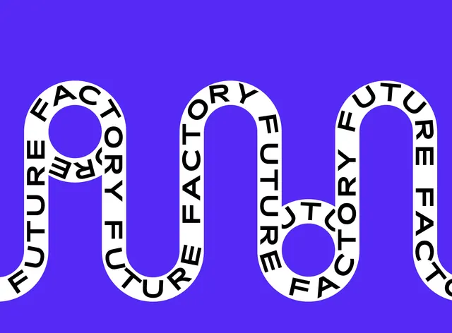
A kinetic typographic composition featuring large rounded sans-serif letters arranged in circular, ribbon-like paths on a vibrant indigo background, creating self-referential text loops.
Summary
A kinetic typographic design for 'Factory Future' where oversized, rounded sans-serif letterforms bend into circular paths on a vibrant indigo background, spelling the brand name through self-referential loops.
Visual description
Three large circular letterform compositions dominate a bright indigo background. Each circular shape contains letters (reading "FACTORY FUTURE" when traced along the curved paths) arranged so the type itself outlines the circle's perimeter. White characters with uniform stroke weight follow curved trajectories, creating the effect of words spiraling around themselves. The letters are open, rounded, geometric sans-serif with considerable letter spacing, anchored horizontally across the frame. The composition creates movement and optical tension through the contradiction between the static circular forms and the reading momentum of the looping text.
Key takeaway
The technique of using letters as both content and container: the word describes what the form is (circular) while being shaped by that form. The generous letter spacing maintains readability despite the curves, preventing the design from becoming illegible ornament. The vibrant indigo background provides bold contrast and energy without competing with the white typography.
Reuse notes
Excellent for creative, tech, or design-focused brands wanting personality and movement without animation. The circular text works as a primary mark, secondary pattern, or poster element. Pairs well with modern branding systems needing a distinctive, memorable signature. May read as logo, type treatment, or illustration depending on context. Best at display sizes; smaller scales risk readability issues.
More like this

Keep what you find
A free account saves references to boards and can send you a weekly email of picks based on what you save.
To see every result, go Pro.