Preview image. Unlock full-res
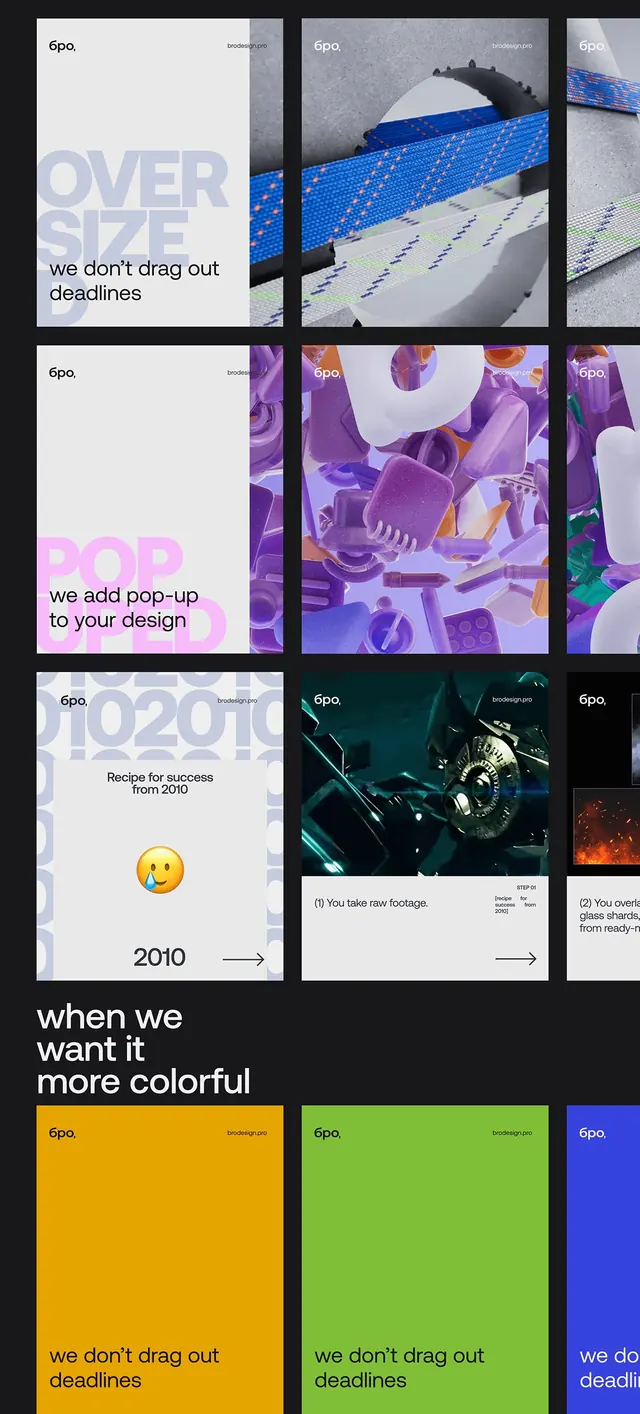
Portfolio grid layout showcasing modular case-study cards with mixed photography, 3D renders, oversized type, and vibrant color blocking (blue, purple, yellow, green) separated by thick black borders.
Summary
A design studio's portfolio showcasing case studies in a modular grid divided by thick black lines, mixing photography, 3D renders, and color-blocked sections with oversized sans-serif headlines.
Visual description
Black background with white grid dividers creating a brutalist nine-cell layout. Top row: white card on left with oversized pale "OVER SIZE" headline and text "we don't drag out deadlines", center card showing a blue pixelated landscape with 3D rendered object, right edge shows green pixelated pattern. Middle row: left card pure white with "we add pop-up to your design" in bright pink, center fills with purple and magenta 3D rendered objects and components, right shows more purple digital elements. Bottom row: left white card with "2010" and yellow emoji, "Recipe for success from 2010" copy, center shows dark 3D mechanical photography with film strip annotation, right shows orange glow effect. Footer text reads "when we want it more colorful" over black. Bottom strip displays three color fields: yellow, lime green, and electric blue, each with "6po" branding and "we don't drag out deadlines" repeated text. The "6po." logo appears consistently in corners.
Key takeaway
The modular grid with thick black dividers creates visual rhythm while keeping each project isolated and scannable. Color blocking (solid fields paired with imagery) adds energy without oversaturating. Oversized headlines sit within white frames to ensure legibility over complex backgrounds. The brutalist grid structure gives a sense of organized chaos that reads as confident and contemporary.
Reuse notes
Excellent model for creative agency portfolios, particularly tech-forward or experimental design studios. The mix of photography, 3D renders, and solid color fields keeps visual variety high without feeling scattered. The grid format works for both web and print applications. Works best for brands comfortable with bold, energetic presentation; the strong colors and overlapping elements can feel chaotic for minimalist-leaning brands.