Preview image. Unlock full-res
A full-page design-agency site with gradient header (blue to peach), service listings, client logos, portfolio grid, and contact form in black-and-white with accent color.
Summary
A vertically scrollable agency site with gradient header (blue-to-peach), structured service rows, client-logo section, portfolio pieces, and a closing contact area featuring a cream form card.
Visual description
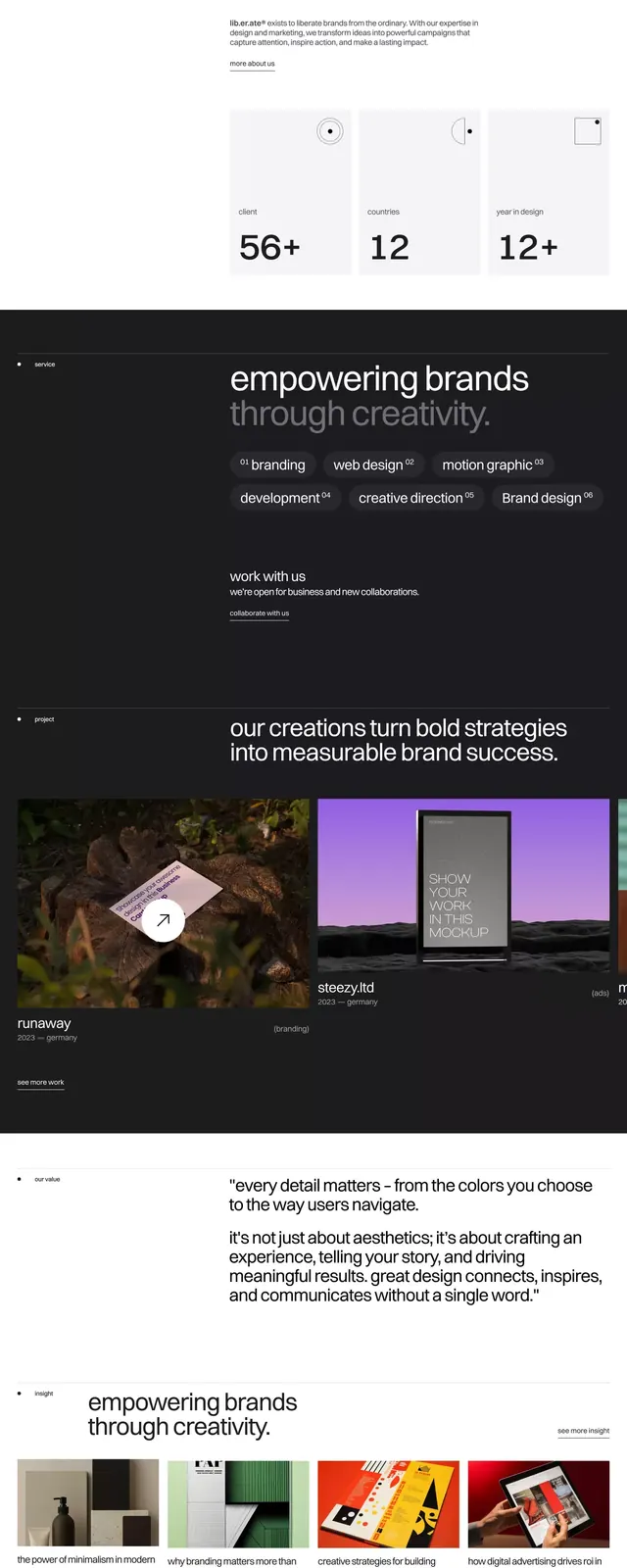
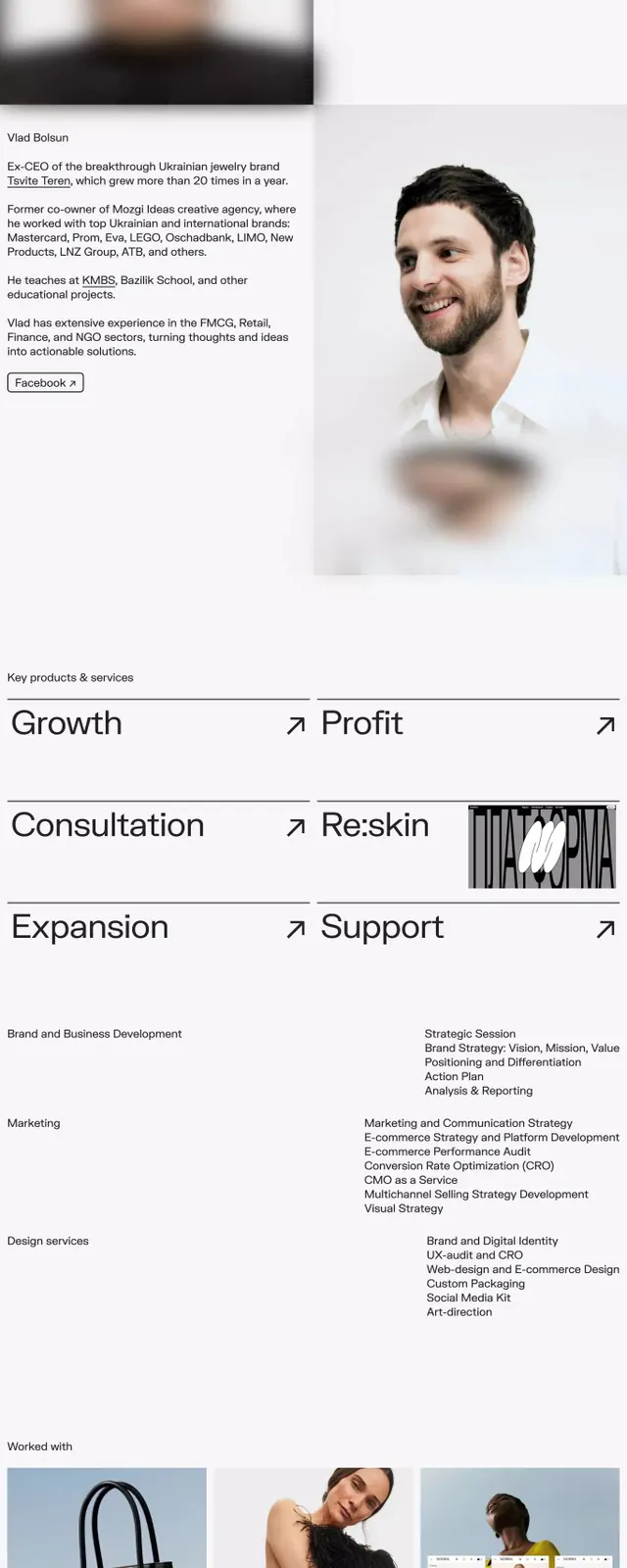
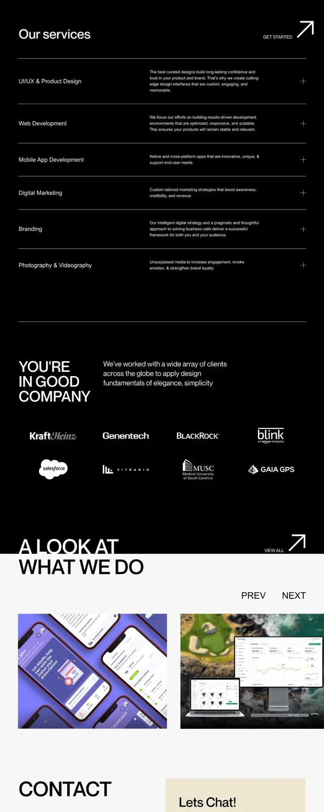
The page begins with a narrow header showing the agency name, navigation, and contact link in white text. Below, a soft gradient background transitions from pale blue (top) to warm peach/orange (bottom), underneath a bold headline ("UNIQUE DESIGN IN STEP WITH THE TIMES") and a block of descriptive copy. A "Services" section follows with rows of service titles (each on black or white background, alternating) paired with explanatory text and arrow icons. A "Who's in good company" section displays client logos arranged in a loose grid. A portfolio section titled "A LOOK AT WHAT WE DO" shows thumbnail images of past work in various formats (wireframes, mockups, product shots). The footer contains a cream-colored contact card with a "Let's Chat!" button, email, and social links. Minimal ornamentation; almost no color except the gradient accent and the cream card.
Key takeaway
The gradient header as a visual anchor and energy source without overwhelming the minimal palette. The alternating background pattern in the services section creates rhythm through contrast alone. The client-logo section positioned mid-page provides social proof without taking visual focus. The warm cream card at the end stands out naturally against the dark background and signals a call-to-action. The vertical flow feels intentional and breath-able.
Reuse notes
Strong template for B2B agencies, consultancies, or specialized service studios. The light-dark contrast and minimal color scheme convey trustworthiness and professionalism. The gradient header works especially well in print-to-digital transitions and social media hero images. Avoid heavy imagery; this style depends on typography and contrast. Scale down the gradient for smaller viewports; the hero should remain a focal point without dominating on mobile.