Preview image. Unlock full-res
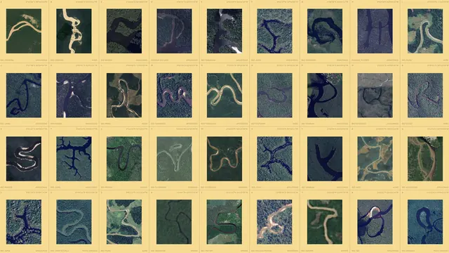
A full-bleed sand-yellow grid of satellite river tiles arranged as a complete alphabet and numerals, each captioned with river name, state, and coordinates.
More like this
See all
Summary
A dense reference sheet where every letter and numeral of the alphabet is represented by a satellite photograph of a real river bend, gridded on sand yellow and labeled with coordinates and place names.
Visual description
The frame is a flat sand-yellow field filled edge to edge with a four-row grid of ten portrait image tiles per row, separated by thin yellow gutters. Each tile is a satellite crop in deep greens, navy blues, and grey-greens where a pale tan or dark river channel twists into a shape resembling a letter. Every cell is bracketed by two caption rules in small all-caps sans type set in a darker earth tone: above the tile, a letter or numeral marker at far left (running A through Z, then 0 through 9) and a coordinate pair at far right; below the tile, the river name at far left and the Brazilian state at far right, including Rio Madeira, Rio Crepori, Rio Negro, Rio Juma, Rio Catrimani, and Rio Tamitatoala across states such as Amazonas, Para, Acre, Amapa, Roraima, Rondonia, Maranhao, and Mato Grosso. The bottom row is cropped by the frame edge so the grid reads as continuing past it. No headline, no logo, and no other type appear.
Key takeaway
Treating the alphabet as an archive rather than a font specimen: each glyph is a piece of documented geography, and the repeated marker plus coordinate plus name plus state caption gives forty otherwise unrelated photographs one grammar. Cropping the last row signals a catalogue larger than the page.
Reuse notes
Strong template for any identity built from found or collected source material, and for brand book spreads that need to show breadth in a single frame. It demands a lot of usable imagery at consistent crop and color, and the tiny caption type means it only works at large print size or full-screen. Pairs naturally with a single-line rationale frame that zooms into a handful of the same tiles.
More like this


Keep what you find
A free account saves references to boards and can send you a weekly email of picks based on what you save.
To see every result, go Pro.