Preview image. Unlock full-res
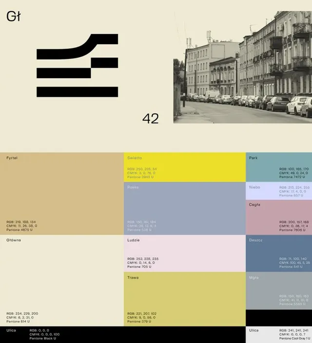
A cream Swiss-grid brand sheet pairing a striped logotype and a black-and-white street photo with a labeled swatch grid of named city colors and their print values.
Summary
A brand color-system page on cream stock: a striped horizontal logotype top-left, a black-and-white street photograph top-right, and a full lower grid of named color swatches each annotated with RGB, CMYK, and Pantone values.
Visual description
The sheet divides into an upper and lower zone. Top-left holds a compact logomark built from stacked horizontal bars suggesting letterforms, with two small Polish-looking labels nearby and a large "42". Top-right is a grayscale photo of a European city street lined with parked cars and tenement facades. The lower two-thirds is a tightly packed swatch grid: roughly a dozen color fields in muted yellow, dusty blue, sage, mauve, tan, and pale pink, separated by a near-black column. Each block is tagged with a Polish color name and a small stack of RGB, CMYK, and Pantone codes set in tiny mono-like type, turning the palette into a printable spec.
Key takeaway
Presenting a palette as a documented spec, every swatch carrying its name plus three color-space values, not just a pretty strip. Anchoring an abstract color system to a real place via one editorial street photo. The black gutter column that visually separates and frames the warm and cool swatch families.
Reuse notes
A template for place-branding or architecture identity decks where the palette must be reproducible across print and screen. The named-swatch-plus-values format doubles as a usable handoff artifact. Pairing it with documentary photography grounds an otherwise austere grid; keep the photo monochrome so it never competes with the swatches.
More like this









Keep what you find
A free account saves references to boards and can send you a weekly email of picks based on what you save.
To see every result, go Pro.