Preview image. Unlock full-res
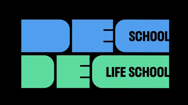
A stacked wordmark using geometric, blocky letterforms split into three horizontal sections with blue, green, and black, spelling DEC SCHOOL and DEC LIFE SCHOOL.
Summary
A two-tier stacked wordmark where DEC SCHOOL and DEC LIFE SCHOOL are rendered in chunky, rounded geometric sans-serif letters split across two color blocks: bright cobalt blue above, lime green below.
Visual description
Black background with two rows of large, geometric sans-serif letters. Top row: DEC (in white) + SCHOOL (in white), set against a bright cobalt blue rectangular block with rounded corners at the edges. Bottom row: DEC (in white) + LIFE SCHOOL (in white), set against a bright lime-green rectangular block with rounded corners. The letters are deeply condensed and blocky, with even weight throughout. Negative space is minimal and geometric. The rounded corner treatment on each color block gives the design a contemporary, approachable softness despite its boldness. No texture, no gradients. The two-color system is complementary-cool (blue-green), high contrast against black.
Key takeaway
The rounded geometric block approach for marking distinct sections while keeping type heavyweight; the complementary color pairing (blue-green) which reads modern and calm; the stacking strategy itself, which makes the mark more memorable by pairing concepts (SCHOOL + LIFE SCHOOL) visually.
Reuse notes
Ideal for educational institutions, ed-tech, or non-profits where approachability and trust matter. The color blocking works for signage and digital. The blue-green is tonal enough to feel cohesive but distinct enough to separate information. The condensed, heavy letterforms demand sufficient space, so avoid cramping. Works best on light or dark solid backgrounds; pattern backgrounds would dilute the clarity.
More like this




Keep what you find
A free account saves references to boards and can send you a weekly email of picks based on what you save.
To see every result, go Pro.