Preview image. Unlock full-res
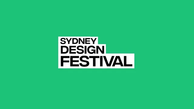
A three-line 'SYDNEY DESIGN FESTIVAL' logotype set in heavy black condensed caps inside white knockout blocks that step rightward like a staircase, centered on a flat emerald-green field.
Summary
A "SYDNEY / DESIGN / FESTIVAL" logotype in heavy black condensed caps, each word riding inside its own white knockout block. The blocks shift progressively to the right, forming a descending staircase on a flat emerald-green field.
Visual description
The mark sits centered on a saturated green ground with wide empty margins. Three stacked lines of bold condensed grotesque caps are set tight, almost touching, with each word reversed out as black type inside a snug white rectangle. The rectangles do not align left: each successive block is nudged rightward and slightly overlaps the one above, so the unit reads as a stepped staircase rather than a flush stack. Black type, white blocks, green field, three colors only.
Key takeaway
The stair-step knockout system: wrapping each word in its own tight white panel and offsetting the panels horizontally turns a plain three-line stack into a dynamic, motion-ready logo. It also makes the mark portable, the white blocks let it drop onto any photo or color while staying legible.
Reuse notes
Ideal for an event or festival identity that needs flexibility across posters, banners, and signage. The offset-block grammar animates naturally (blocks can slide in one by one) and survives on busy backgrounds because of the white containers. Use a genuinely condensed face so the blocks stay compact; a wide face would break the staircase rhythm.
More like this


Keep what you find
A free account saves references to boards and can send you a weekly email of picks based on what you save.
To see every result, go Pro.