Preview image. Unlock full-res
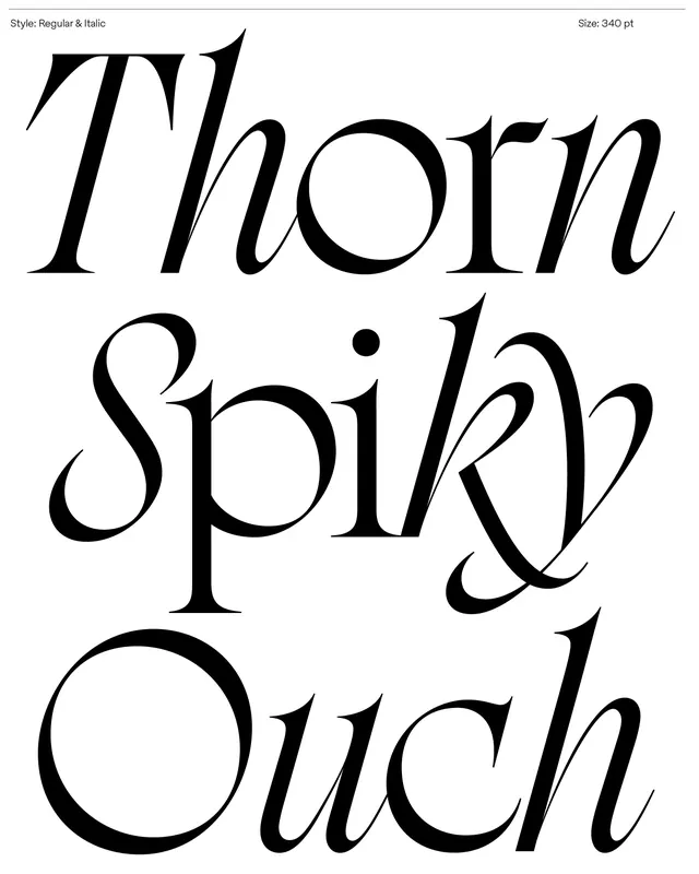
Display serif typeface in regular and italic weights shown stacked vertically, demonstrating high contrast thick-thin strokes and flared terminals.
Summary
Display serif typeface in regular and italic weights shown stacked vertically, demonstrating high contrast thick-thin strokes and flared terminals.
Visual description
Three lines of large black serif text stacked vertically on white: "Thorn", "Spiry", and "Ouch" (left-aligned). Each line uses the same typeface in italic form, with regular weight marked in the header as 340 pt. The serif exhibits extreme contrast between thick vertical strokes and hairline horizontals, particularly visible in letters like "T", "S", and "O". Flared or curved terminals appear at stroke ends. Generous negative space between lines prevents the composition from feeling cramped despite the oversized point size. Header notation shows "Style: Regular & Italic" and "Size: 340 pt". Black ink on white, no color, no additional ornament.
Key takeaway
The extreme thick-thin contrast and serif detail create drama without decoration. Stacking text with tight leading and large word spacing lets each line breathe and showcases the italic nuance. Italic inflection is visible and distinctive despite the large scale.
Reuse notes
Strong choice for editorial layouts, luxury branding, or sophisticated headlines where elegance and presence matter equally. The contrast ratio means it works at any size and holds up in reduced applications. Less suitable for body copy or digital screen use due to fine hairline serifs.
More like this






Keep what you find
A free account saves references to boards and can send you a weekly email of picks based on what you save.
To see every result, go Pro.