Preview image. Unlock full-res
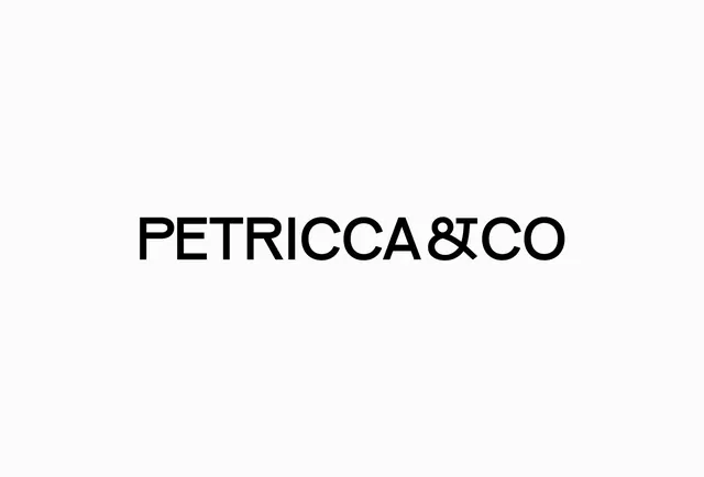
A minimal black wordmark reading 'PETRICCA&CO' in clean sans-serif caps, with the ampersand fused into the C as a single ligature, centered on an off-white field.
Summary
A single-line black wordmark, "PETRICCA&CO", where the ampersand is tucked into the C so the two letters share a stroke, set in a clean geometric sans on near-white.
Visual description
The logotype sits dead center on a large off-white field with generous surrounding space and nothing else on screen. All caps, medium weight, even tracking, in a geometric sans-serif with open counters and humanist details. The defining move is the join between "&" and "CO": the ampersand nests against the C so they read as a connected ligature rather than three separate marks, tightening the lockup. No tagline, no icon, no color, the entire identity rests on the type and spacing.
Key takeaway
The ampersand-into-letter ligature, which turns a routine "& CO" suffix into a small custom detail that signals craft. Letting one wordmark carry the whole brand on a near-empty canvas, where the surrounding white space is the design. Choosing a geometric sans clean enough to feel modern but humanist enough to avoid looking cold.
Reuse notes
A good reference for fashion, studio, consultancy, or any "& Co" partnership brand wanting understated luxury. The ligature trick adapts to most names ending in a suffix. Because it relies entirely on type, the chosen typeface and the kerning of the join have to be precise, this only works if the spacing is genuinely resolved.
More like this



Keep what you find
A free account saves references to boards and can send you a weekly email of picks based on what you save.
To see every result, go Pro.