Preview image. Unlock full-res
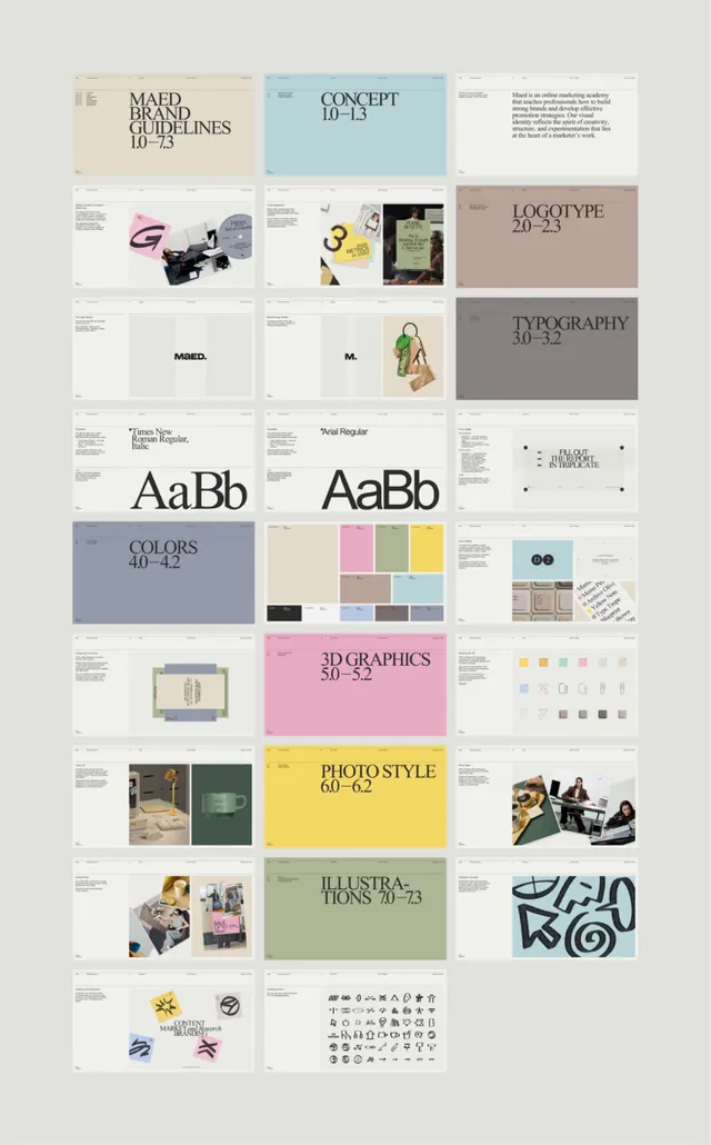
A comprehensive visual guide organized as a modular grid system, documenting brand standards including concept, logotype, typography, colors, 3D graphics, photo style, and illustrations with page numbers and labels.
Summary
A comprehensive visual guide organized as a modular grid system, documenting brand standards including concept, logotype, typography, colors, 3D graphics, photo style, and illustrations with page numbers and labels.
Visual description
A nine-by-three grid of sectioned guide pages, each labeled with a standard component name and page range (Concept 10-13, Logotype 20-23, Typography 30-32, Colors 40-42, 3D Graphics 50-52, Photo Style 60-62, Illustrations 70-73). Each section contains representative imagery or type samples: concept boards with photography and design mockups, logotype applications including the simple mark and wordmark, typography spreads showing type families (Times New and Pixel Regular), color palette swatches in warm and cool tones, rendered 3D objects and shapes, photographs in warm and cool moods, and illustration examples in black line art and organic forms. The overall palette is warm beige, soft gray, muted green, and cream with occasional black type, creating a calm, sophisticated aesthetic suitable for a design studio or creative brand.
Key takeaway
The systematic modular layout makes each design system component scannable as a distinct block; labels with page ranges suggest this is extracted from a larger PDF system. The restrained color palette (mostly neutrals with soft accent colors) unifies the diverse content types, making them read as a coherent visual language rather than a collection of disparate assets.
Reuse notes
Ideal for documenting design systems that need to show a complete toolkit (typography, color, imagery, components) in a single, scannable overview. Works well for presenting to stakeholders or including in brand guidelines PDFs. Best suited to brands that favor calm, professional, neutral aesthetics.
More like this


Keep what you find
A free account saves references to boards and can send you a weekly email of picks based on what you save.
To see every result, go Pro.