Preview image. Unlock full-res
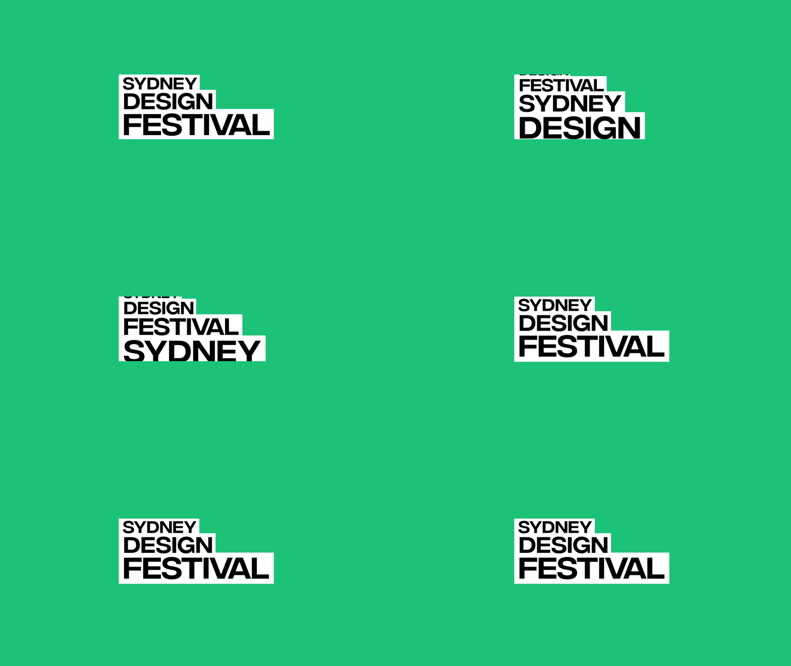
Bold, oversized black sans-serif wordmark for Sydney Design Festival set in white bars on a vibrant teal background.
Summary
A festival wordmark using blocky, all-caps sans-serif type arranged vertically in white-on-teal, with words staggered slightly to create rhythm.
Visual description
Three stacked white rectangular bars on bright teal background, each containing black capital letters spelling SYDNEY, DESIGN, FESTIVAL. The bars are slightly offset horizontally, creating a dynamic composition. Type is set in a heavy, geometric sans-serif with tight letterspacing and strong vertical emphasis. The layout occupies the center third of frame against the uniform teal field.
Key takeaway
Using staggered rectangular bars instead of a single lockup creates visual movement and energy while maintaining clarity. The white-on-teal contrast reads sharply even in motion or at small scale. White bars containing black type solve legibility on bright color fields without needing drop shadows.
Reuse notes
Effective for cultural events, festivals, or contemporary arts brands. Works well as an animated reveal (bars sliding in staggered). Suits design conferences, creative industries, and forward-thinking institutions. Teal choice reads both warm and tech-forward.
More like this


Keep what you find
A free account saves references to boards and can send you a weekly email of picks based on what you save.
To see every result, go Pro.