Preview image. Unlock full-res
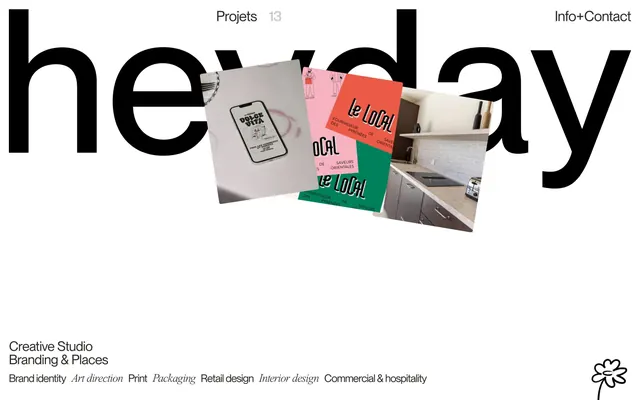
A creative studio portfolio page featuring an enormous black sans-serif wordmark ('heavily') layered behind editorial photographs and project cards in pink, green, and natural tones.
Summary
A bold portfolio layout anchored by an enormous black display typeface that frames layered photographic project cards and lifestyle imagery in a sophisticated editorial grid.
Visual description
The composition is dominated by an oversized, ultra-heavy black sans-serif wordmark that sits behind framed project cards and photographs. Project images are mounted at angles within the layout: a beige envelope mockup, a pink packaging sample labeled "le local" with green accents, an interior kitchen scene, and a dark product shot. Small labels and navigation ("Projects 13", "Info+Contact") are positioned in the negative space. The header identifies it as "Creative Studio" with subheads listing services: "Brand Identity", "Art direction", "Print", "Packaging", "Retail design", "Interior design", "Commercial & hospitality". A small stylized flower logo anchors the bottom right.
Key takeaway
The layering technique of a massive letterform as a background element that organizes and frames the page; the confident contrast between oversized black type and small, colorful project cards; the use of editorial photography cropped at varied scales to create visual rhythm; the mix of product, interior, and lifestyle photography as a cohesive brand voice.
Reuse notes
Excellent for design agencies or creative studios wanting to project confidence and editorial sensibility. The oversized-type technique works best with strong geometric sans-serifs and when there are enough varied project images to layer convincingly. Best applied when the brand has diverse output (packaging, interiors, environmental design) that can sustain the visual complexity. The small accent colors (pink, green) prevent the black-and-white from feeling sterile.
More like this



Keep what you find
A free account saves references to boards and can send you a weekly email of picks based on what you save.
To see every result, go Pro.