Preview image. Unlock full-res
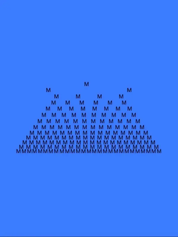
Towering pyramid of repeated uppercase 'M' letterforms, progressively scaling upward from a dense base to a single apex, set on royal blue.
Summary
Towering pyramid of repeated uppercase 'M' letterforms, progressively scaling upward from a dense base to a single apex, set on royal blue.
Visual description
Dark sans-serif 'M' characters arranged in a strict isosceles-triangle composition against a vivid royal-blue background. The base spans nearly the full width with dozens of tightly spaced letters; each row above narrows by one letter per side, creating a sharp symmetrical point at the top. All characters are identically sized and weighted, and the spacing is mathematically uniform, making the form read as a solid geometric shape rather than individual glyphs. The blue field is uninterrupted and provides stark contrast to the black letterforms.
Key takeaway
The pyramid structure as a generative type-pattern template. The constraint of one repeated character creates a scalable, modular visual identity. The monochromatic approach and absolute symmetry read as systematic and intellectual.
Reuse notes
Ideal for tech, fintech, or data-driven brands seeking a distinctive wordmark or heading system. Works as a decorative initial or opener in editorial layouts. Requires confident typographic anchoring of the rest of the brand to avoid feeling gimmicky.
More like this





Keep what you find
A free account saves references to boards and can send you a weekly email of picks based on what you save.
To see every result, go Pro.