Preview image. Unlock full-res
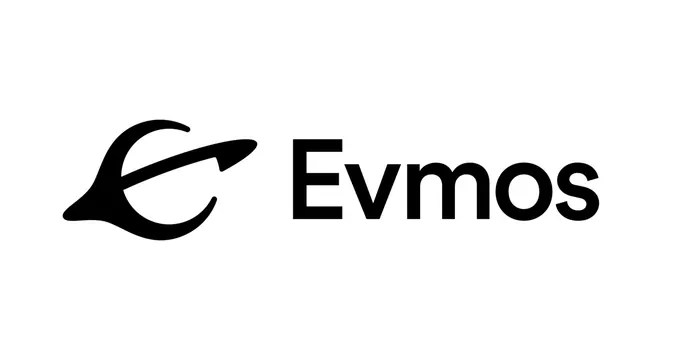
Monochromatic logo combining a fluid, hand-drawn curved mark with a geometric sans-serif wordmark on white ground.
Summary
Monochromatic logo combining a fluid, hand-drawn curved mark with a geometric sans-serif wordmark on white ground.
Visual description
Horizontal lockup on white background. The mark (left) is a dynamic curved abstract form suggestive of motion or fluidity: a thick stroked arc that curves upward and ends in a forward-pointing arrow tip, rendered in solid black. The wordmark (right) is set in a clean, geometric sans-serif in black capitals: 'Evmos'. Both elements are sized to align at baseline and cap-height, with generous negative space between the mark and type. The overall composition reads as balanced and modern, with the organic curve of the mark contrasting gently against the rectilinear precision of the letters.
Key takeaway
The pairing of an organic mark with geometric type: the fluidity lends personality while the sans-serif grounds it in modernity. The forward-pointing arrow within the mark economically conveys growth and direction. The monochrome approach simplifies application across all media while the bold, weighted strokes ensure legibility at small scales.
Reuse notes
Strong fit for fintech, crypto, or forward-looking tech companies. The hand-drawn quality prevents clinical coldness while the sans-serif maintains professional credibility. The mark's directional thrust pairs naturally with horizontal layouts and directional messaging (roadmaps, progressions, forward motion).