Preview image. Unlock full-res
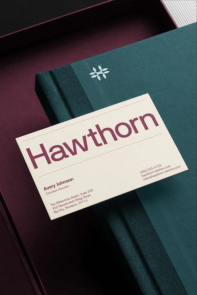
A teal folder and cream business card system with a small geometric mark and burgundy sans-serif wordmark.
Summary
A stationery system pairing a teal textured folder with a cream business card printed in burgundy type and a small geometric asterisk-like symbol.
Visual description
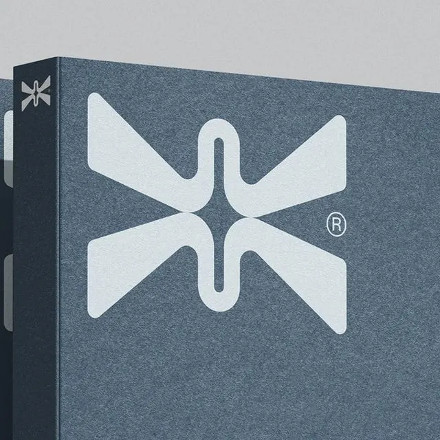
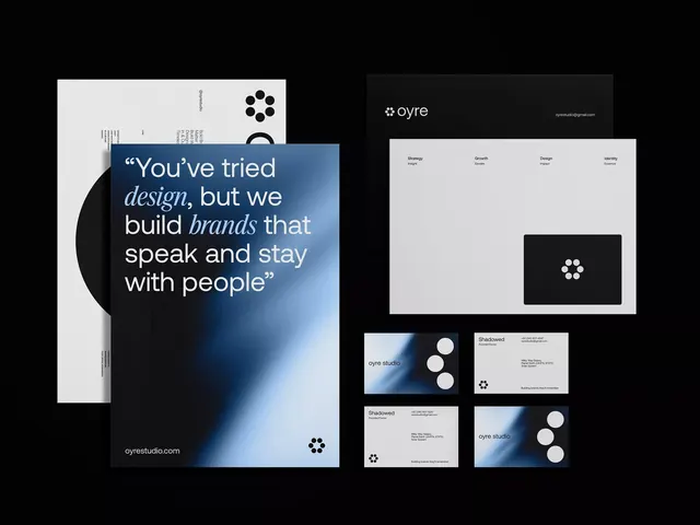
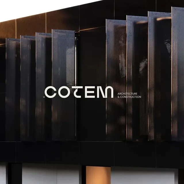
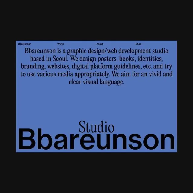
A sophisticated product mockup shows a cream business card (landscape orientation) positioned diagonally across a deep teal textured folder. The business card features "Hawthorn" in large burgundy sans-serif at top-left, with the contact information for Avery Johnson, Creative Director, in smaller type below. A small six-pointed geometric mark in white sits at the upper-right of the folder. The color palette is cool and restrained: deep teal, burgundy, cream, charcoal, and black. The folder has a visible fabric or textile surface texture. A diagonal stroke of pink or magenta appears at the upper-left edge, and diagonal striped pattern is visible on a white panel in the top-right corner, suggesting layered branded material.
Key takeaway
The restraint of a three-color identity (teal, burgundy, cream) used across tangible materials to create cohesion without excess. The pairing of a geometric mark with a sans-serif wordmark, each playing a distinct role. The use of real material texture (folder fabric) as part of the brand expression rather than relying on flat design alone.
Reuse notes
Reference for luxury and professional-services branding, design studios, and editorial houses. The teal-and-burgundy palette works particularly well in cool climates and sophisticated contexts. The diagonal composition adds movement to a business-card mockup without disrupting hierarchy. Scale the geometric mark carefully if adapting; it should remain a subtle accent, not compete with the wordmark.