Preview image. Unlock full-res
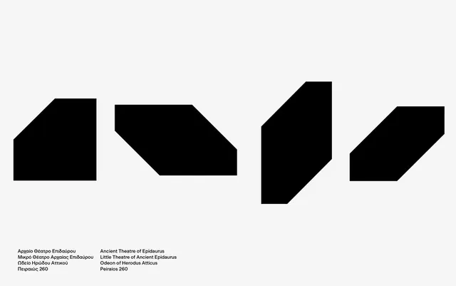
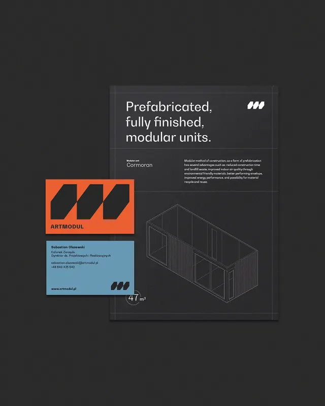
Geometric modular-building logo combining angled parallelogram shapes in dark tones with a light backdrop and technical diagram.
Summary
Geometric modular-building logo combining angled parallelogram shapes in dark tones with a light backdrop and technical diagram.
Visual description
Dark charcoal background with a centered composition: an orange rectangle containing three black angled shapes arranged horizontally (the core logo), below it a light blue business-card mockup with contact details, and to the right a wireframe isometric drawing of stacked modular units. The logo uses bold geometric parallelograms in black as the primary mark. A light gray text block and small pattern element appear in the upper portion. Typography is clean sans-serif throughout. The color palette is deliberately restrained: orange, blue, dark gray, and white with minimal intermediate tones.
Key takeaway
The use of angled geometric primitives (parallelograms) to suggest stacked modular construction. The isometric technical diagram paired with the abstract logo creates credibility. The three-part layout (logo detail, business-card format, diagram) compresses a full identity into one frame.
Reuse notes
Ideal for architecture, construction, or modular-product branding. The parallelogram language works for any stackable, prefabricated, or compartmentalized offering. The minimal palette and geometric approach suit technical or B2B positioning.