Preview image. Unlock full-res
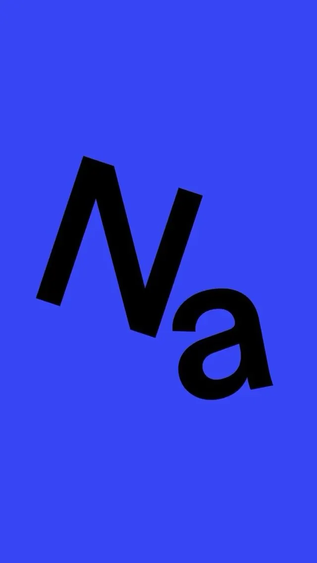
Via, a three-letter wordmark set in heavy black sans-serif against a vivid electric-blue background, striking a bold contrast.
Summary
A bold three-letter wordmark in heavy black sans-serif set against a vivid electric-blue background, relying on weight and color contrast for impact.
Visual description
The word "Via" is rendered in a dense, nearly geometric sans-serif with very heavy stroke weight, the letters compressed and taking up most of the compositional space. Each letter fills a third of the horizontal field: the angled A, the curved and open-counter a, and the vertical I create varied letterforms within the same family. Against the bright electric-blue background (approximately RGB blue at full saturation), the jet-black letterforms create maximum contrast. The composition is centered and fills the entire frame, allowing no breathing room, making the wordmark itself the sole visual focus.
Key takeaway
The saturation of the background color (electric blue at near-maximum saturation) amplifies the black letterforms without needing a border or container. The weight of the typeface translates confidence into form. Negative space within the letters (the counter of the a) keeps the density from feeling suffocating. Three letters is a compact, memorable brand anchor.
Reuse notes
Best for brands seeking authority and directness (SaaS, logistics, mobility, or tech platforms). The vivid color is risky in print or outdoor contexts where saturation may shift or bleed; safest in digital contexts (apps, websites) where color reproduction is controlled. Works at large scale (billboards) and small scale (favicon) due to letter weight and contrast.