Preview image. Unlock full-res
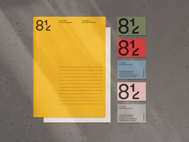
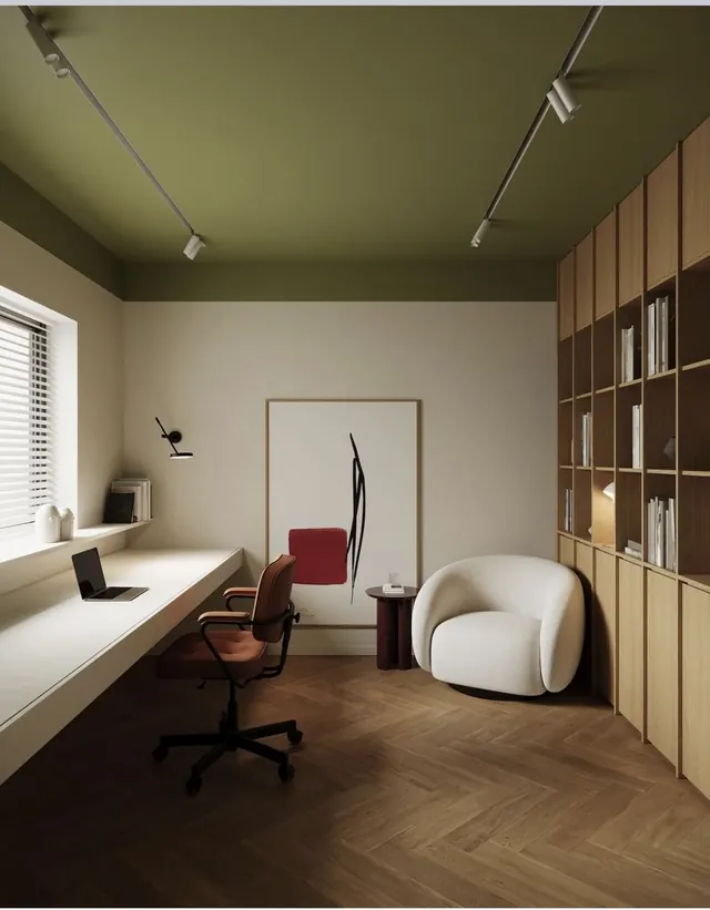
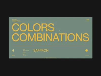
A structured color reference pairing muted sage green, warm saffron, and charcoal on a textured surface, labeled with palette name and color identifier.
Summary
A color palette specimen sheet displaying a muted sage green paired with warm saffron, set against a dark charcoal ground, with a numbered reference label showing palette identifier and color name.
Visual description
A horizontal rectangular card with a muted sage-green background anchors the composition. The color name "COLORS COMBINATIONS" appears in oversized saffron-yellow sans-serif type, filling most of the card. A dark label bar runs along the bottom, containing the palette number "4," small reference swatches in green and saffron, and the color name "SAFFRON" set in small caps. A small saffron dot accent floats on the upper right corner. The entire piece is photographed against a charcoal background, showing the card's subtle edge and paper texture.
Key takeaway
The numbered, indexed approach to color specimens (adding sequence and metadata below the name). The restrained palette of exactly three colors working in concert (dark neutral ground, mid-tone earth, bright warm accent). The visual rhythm created by oversized type against a small reference bar below.
Reuse notes
Effective as a color system reference card, product packaging swatch sheet, or design guideline page. Works well in editorial and lifestyle contexts where earthy, sophisticated color stories are needed. The muted green reads as calming and premium; pair with serif or display type to elevate further.