Preview image. Unlock full-res
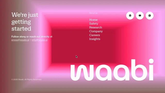
Tech startup landing page using a radial gradient background transitioning from soft rose tones at the edges to vibrant magenta-hot pink at the center, pairing white sans-serif headlines with a navigation menu and social links.
Summary
Tech startup landing page using a radial gradient background transitioning from soft rose tones at the edges to vibrant magenta at the center, with large white sans-serif wordmark and minimal navigation.
Visual description
The page features a prominent radial gradient as the dominant hero background, starting pale rose/blush at the outer edges and intensifying to hot magenta and red in the center, creating depth and visual focus. Large white sans-serif text reading "We're just getting started" anchors the left side with a supporting sub-headline and email contact links in light grey. Navigation menu items (About us, Home, Safety, Research, Company, Careers, Insights) align vertically in the upper-right area. Three circular social-media icon buttons (LinkedIn, YouTube, Twitter) sit at top-right in white with subtle shadows. The brand wordmark "waabi" appears large in white at bottom-center, overlapping the gradient. Clean whitespace and the centered vertical axis create a modern, spacious composition.
Key takeaway
The radial gradient technique creates visual depth and focus without requiring photographic imagery. Pairing high-contrast white type against a warm, saturated gradient ensures readability while maintaining visual impact. The restrained navigation and contact placement guide attention to the gradient backdrop and messaging rather than cluttering the space.
Reuse notes
Effective for tech-forward SaaS or startup landing pages where a bold color story and premium feel matter. Works best with short, punchy headlines and a single CTA. The gradient technique can overwhelm if text weight is too light, so pair with strong display type. Avoid when brand colors skew towards cool tones unless the gradient is adapted.
More like this







Keep what you find
A free account saves references to boards and can send you a weekly email of picks based on what you save.
To see every result, go Pro.